
|
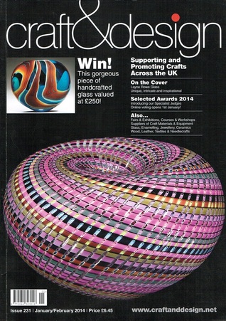
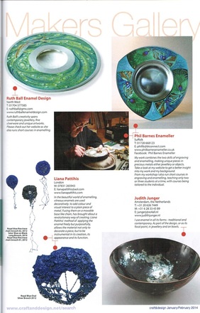
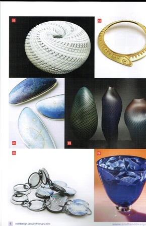
A great big THANK YOU to Craft & Design - find me in the "Makers Gallery" and "Enamelling in Europe"
Copyright : Craft & Design and Individual Makers
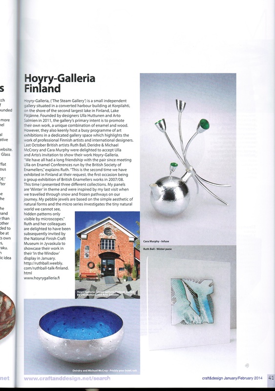
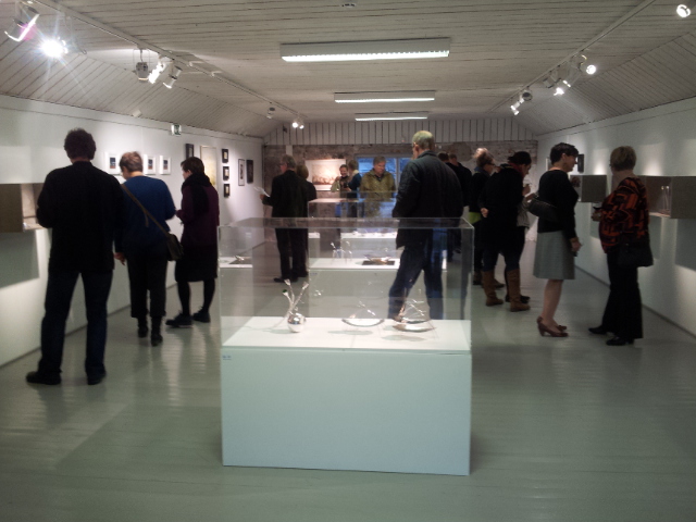
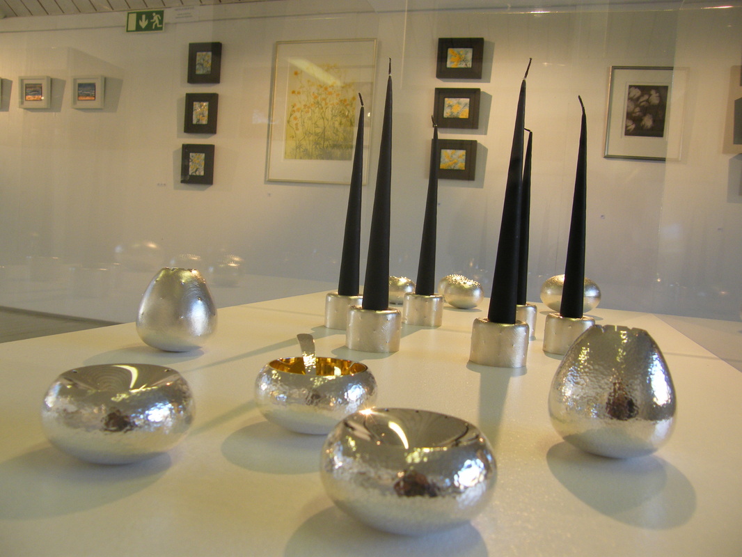
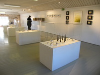
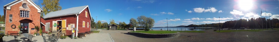 Hoyry-Galleria which translates in English to "The Steam Gallery" is a small independent gallery situated in a converted harbor building at Korpilahti, on the shore of the second largest lake in Finland, Lake Päijänne. Founded by designers Ulla Huttunen & Arto Salmien in 2011 the galleries primary intent is to promote their own work, a unique combination of enamel and wood. However, they also keenly host a busy programme of art exhibitions in a dedicated gallery space which highlights the work of professional Finnish artists and international designers. I am delighted to have been able to travel to Finland and display my work alongside the work of Irish Silversmith's Michael McCrory and Cara Murphy plus Enameller & printmaker Dierdre McCrory ........Read more about the SILVER & ENAMEL exhibition here
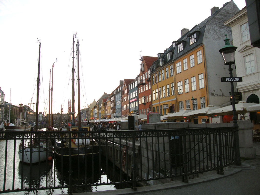
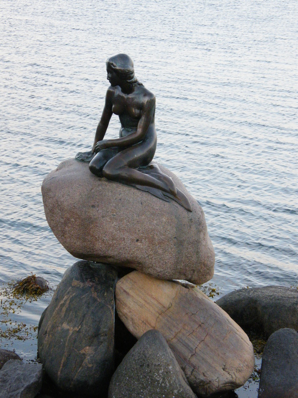
I was invited this week to teach with the Danish Guild of Enamellers. I few from Manchester to Copenhegan which was remarkably easy. The flight took less than two hours, quicker for me than a trip to London ! On landing in Copenhegan I was greeted by Tom Lundsten, the Guild organiser, and I was treated to a tour of the city, taking in sights that I have only ever seen from tourist books. Here the national statue "The Little Mermaid", which is indeed, quite little! and the tourist row of cafe's on the harbour are very typical scenes.
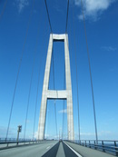
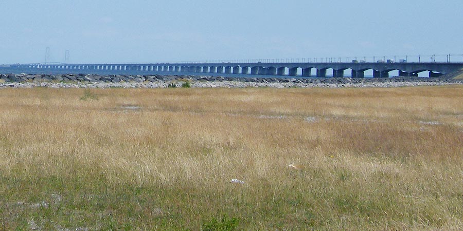
To get to the workshop venue, travelling from Copenhegan, we then had to travel along the second longest bridge in the world ! The bridge links one of the several islands that form Denmark. From the begining of the bridge, to the finish, the end seems quite out of sight!
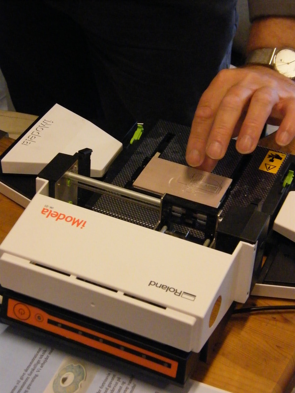
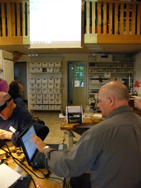
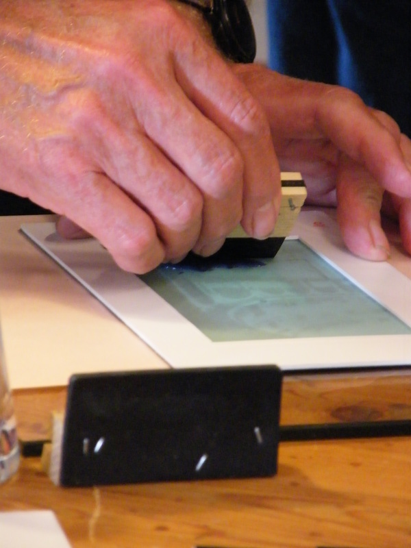
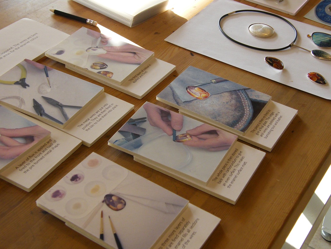
The weekend was generously hosted by the Danish metal & tool supply comany called Ravestedhus, which is based in the small country village of Ravested. Their range of facilites are very enviable and well worth the three hour journey from the city. 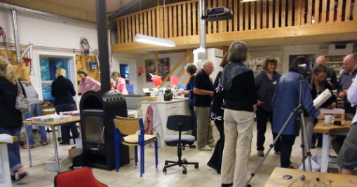 The meeting hosted around twenty enamellers and four demonstrations took place during the three day event. Namely, screen printing by one of the group members / computerised cutting on a very cute table top milling machine by Tom / Champleve Cutting by Phill Barnes / and my task was to demonstrate Cloisonne techniques.
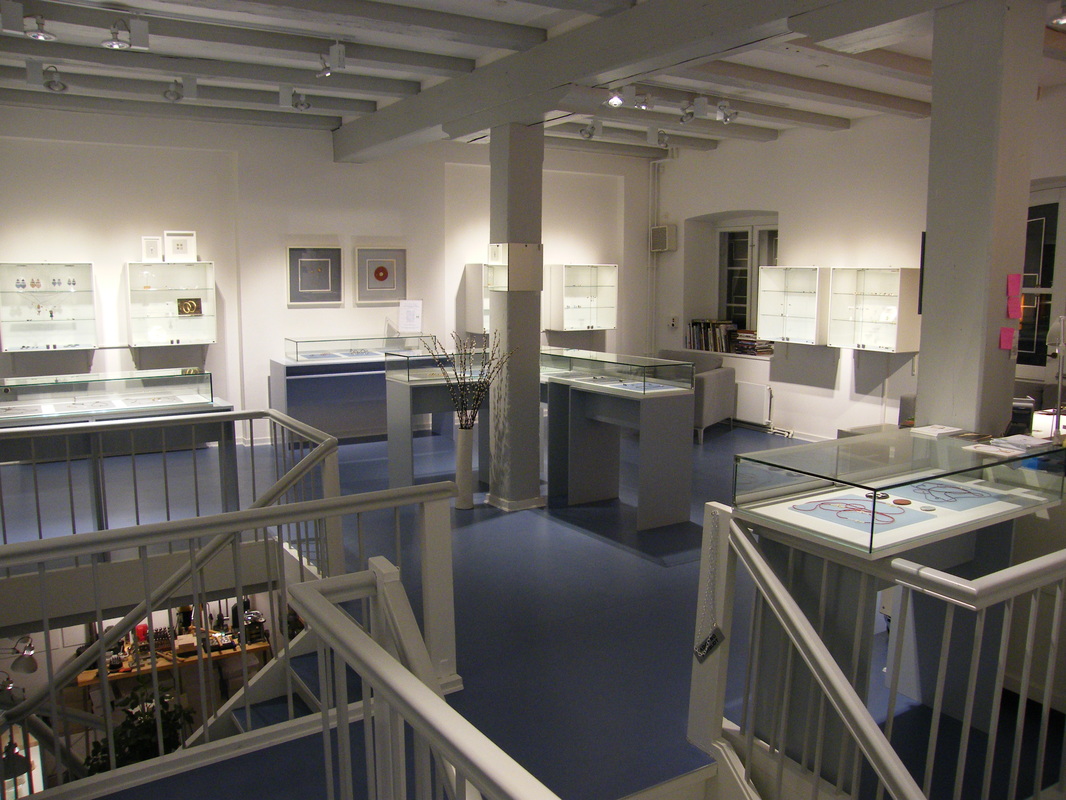
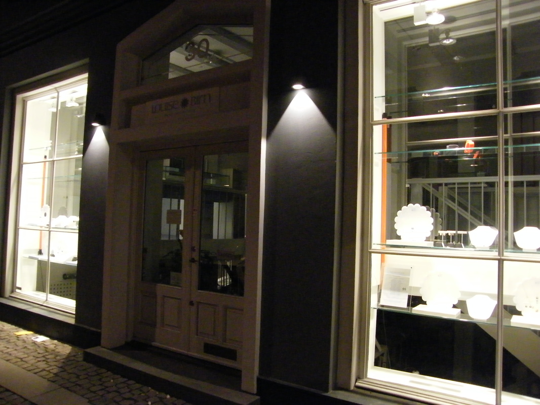
It was a pleasure and a privalage to share in such an event and everyone I met was so lovely and very welcoming. The highlight of the weekend was also being able to visit and stay with leading Danish enameller Louise Birn, who has a superb gallery and workshop in the centre of Copenhegan. Louise stocks not only her own stunning designs but also represents the work of around eighteen other international designer-makers and should be a definate stopping off point if you ever get the chance to stay in Copenhegan.
So back now, a bit tired but very inspired ! ...thought I'd sign off with this amazing sunset, photographed from the door of the Ravstedhus workshop...  Catching up on recent travels. Over the bank holiday we went to the Yorkshire Sculpture Park and The Hepworth Gallery in Wakefield. Both venues are amazing and well worth the visit. 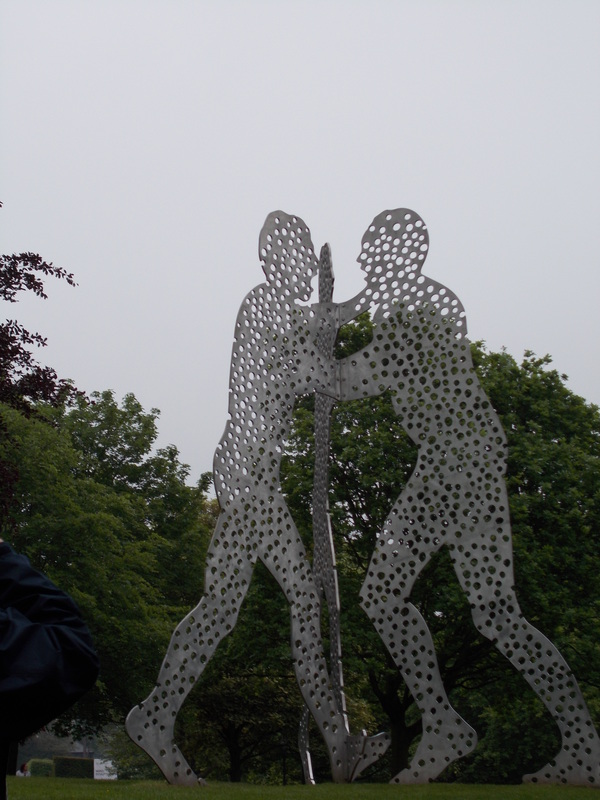 At YSP walks through the grounds are stunning and the large sculpture dominates yet compliments the parkland. Currently there is a really comprehensive exhibition of Miro's scultpure/ prints and drawings but unfortunalety my photos of it are not great. If you like his work though, GO ! Many pieces are on loan form other intitutions so it s a good time to see all the work together. However, I seem to be drawn to the work of Barbara Hepworth at the moment. It was good to see some of her monumental works before traveling on to the newly opened Hepworth Gallery in Wakefield. From this visit one day I'd also like to go to her gallery museum space hosted by the Tate in St Ives http://www.tate.org.uk/visit/tate-st-ives/barbara-hepworth-museum. There are also plenty of on-line inspirational sources. Discover more about Hepworth here on Artsy > https://www.artsy.net/artist/barbara-hepworth 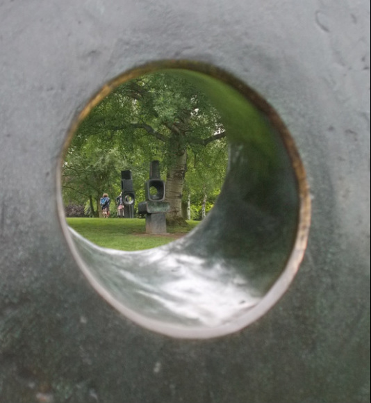 At the Hepworth in Wakefield it was interesting to observe the changes in scale. There on exhibition in the splendid gallery spaces, are also her models and working maquets. 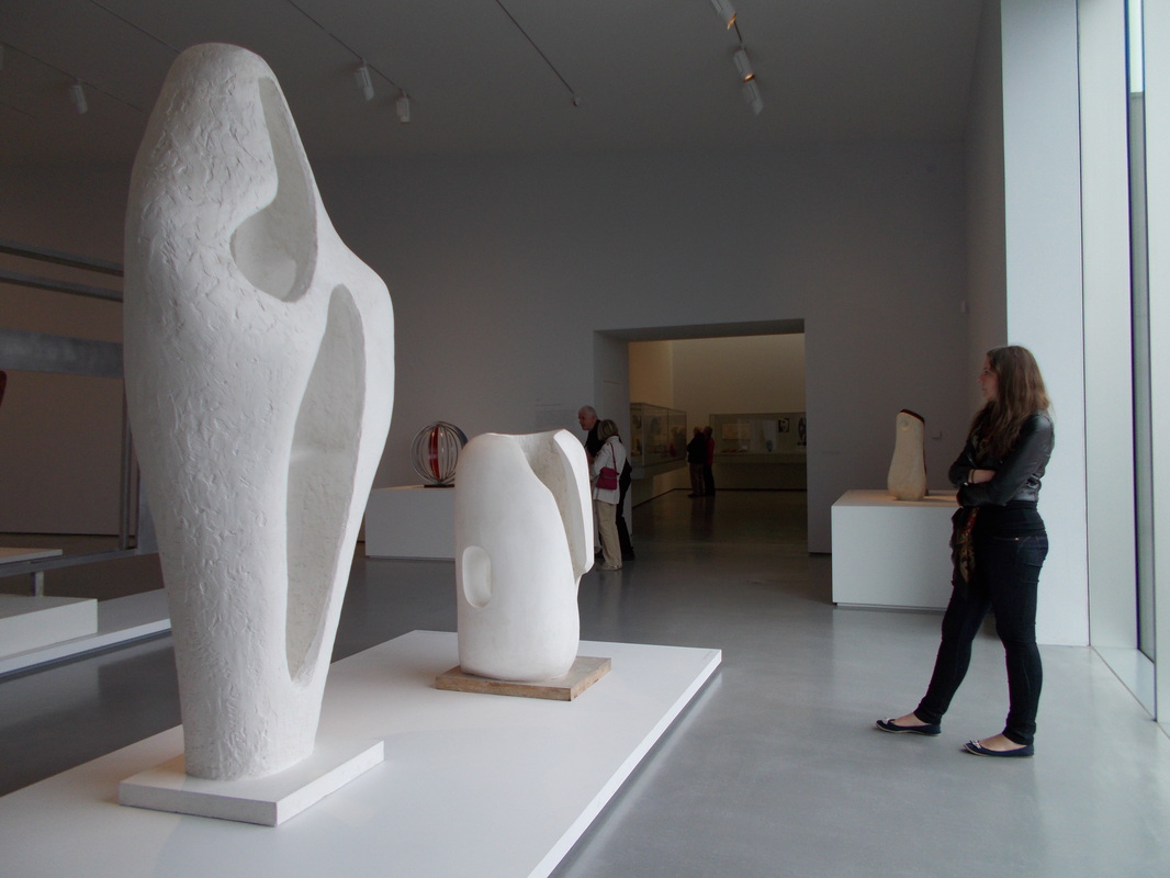 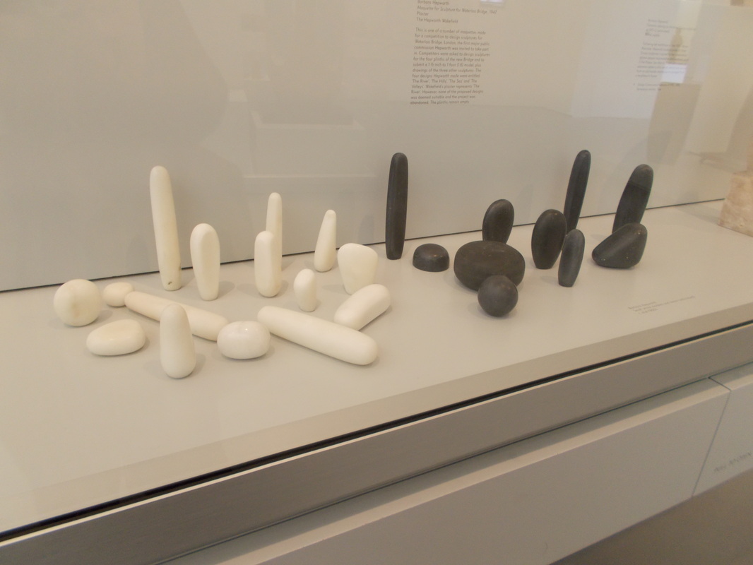 I partulary loved this display of black and white marble shapes. Its funny when you see an idea come together, isn't it.... Have you ever had the experiance so seeing something then recognising the elements in your own work ? I must be subliminally influenced and I've never seen these before ! With the Shore Jewel series that I'm working on, I am developing the idea of adding small containers to the range. The image below is a photo I took last year of my collection of pebbles with the silver shapes that I'm developing.....spooky. 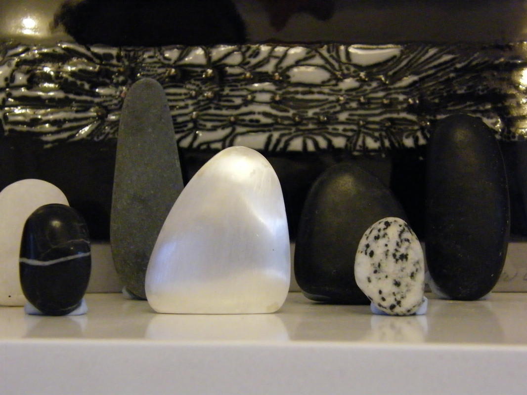 The bright shape, just off centre, is silver and the rest of the shapes are my collected pebbles. The panel at the back is a piece by my freind, the Finish enameller Ulla Huttunen. My wish is to make enamels of these forms and make them into small boxes for jewels that will compliment. Seeing the Hepworth marbles makes me realise how this could become possible......
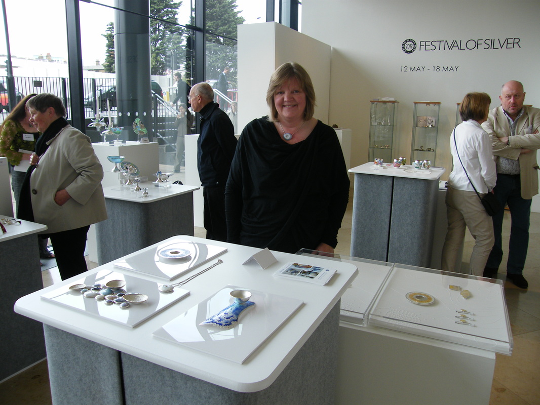 Photo by Rachel Gogerly I was selected for the specialist Enamel Day held on the 17 May at the Pangolin Gallery London, as part of the Festival of Silver Week hosted by Gordon Hamme and team at British Silver week. It was a brilliant day and lovely to meet up with visitors, clients and fellow enamelists.
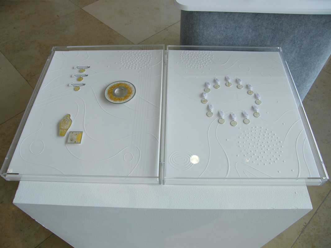
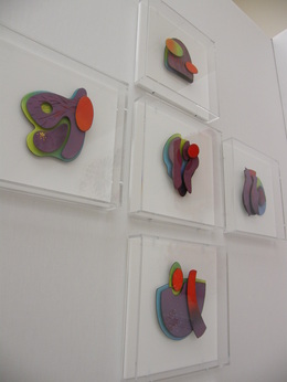 I had great response to my new work for the Bluecoat Display Centre theme "Heroic" which was displayed last week at COLLECT 2012 in the Sattchi Gallery, London. For their theme I chose to explore the work of scientists. The resulting main set of panels that I made celebrate the work of William Henry Perkins, who in 1856 at the age of 18 discovered the first aniline dye, which happened to be a shade of purple. His colour was called "Mauvine" and it is said that it's finding helped change the word. To the dismay of his Father and Tutor, Perkins abandoned his studies and went into production of the colour. His action went on to democratise the availability of such a luxurious hue by making it affordable through mass production. Previously it was a colour created by crushing thousands of shells and throughout history it was so expensive to produce that the higher classes, royalty and religious figures only wore it. His father and brother turned in the end to join and support Perkins by using their own building and architectural skills to build his factory. Proving his discovery successful, his tutor Hoffman, became supportive and also in later years went on to do his own further research into colour formula. 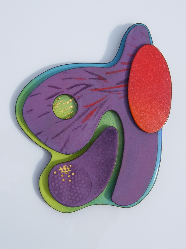 Perkins also found synthetic dyes for green and shades of red and violet. Hence the colour theme on the panels. I added a blue to also represent the fact that the factory was built on the side of a canal. It is noted that the water changed colour every week depending on their production. The shapes of the pieces are based on reflections and flow shapes in water to reference the flow of dyestuff and create an abstract format for the work. In the series each shape selection is different, and as part of the work I want to infer a serendipitous approach. The surfaces of the enamels are matt, granular and also occasionally glossy. Perkins was actually tasked with researching a substance that would cure Malaria. Failure to do so lead to his haphazard finding that the mix of chemicals he was working with presented themselves as a repeatable colour. The fact that he kept trying and had the vision to develop this into an industrial scale business is remarkable. The pieces are mounted individually in Perspex museum type boxes to suggest the format of scientific display. Each piece being like a specimen to examine. When Perkins retired at the young age of 36 he had become rich enough to return to his research and he is credited with being instrumental in as a catalyst for a wide range of important discoveries. The detection of synthetic methods of producing colour have been wide reaching so I have included within each one of the panels a circular point and an image to reference microscopic shapes / images from petri dishes. It is the fact that a colour can evolve to have a medical significance that I find particularly poignant. 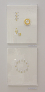 Alongside the lager panel I also exhibited two artworks called "Unknown" and "Unsung" .
There are many stories behind scientific advances and people who go about work that is heroic. They are humble and largely go unmentioned. The format of these cases are consiquently intentionally ambiguous. "Unknown" consists of 12 mini medal shapes hung in a circle format on a hand embossed paper surface. The images in the small medals are made in fine gold wire and foils. Fired onto transparent white enamel, they are based on drawings of matter in petri dishes, and inspired by an illustration of work done by German scientist Robert Koch, who worked in the same era as Perkins and became one of the founders of bacteriology. The ribbons are white to symbolise hope of new discovery and the circle shape is for continuity. The paper embossed lines echo the flow drawings of the colour panel. "Unsung" is dedicated to anonymous modern day scientists who we never hear about but do such invaluable work. The case consists of a 10cm diameter enamel on silver dish. The pattern is suggestive of bacterial growth forms. A colleague told me that it is the bacteria themselves that are the most fascinating thing. There are good and bad bacteria, they give us such delights as wine and chesses and the best can be used to fight the bad stuff! The three safety pins supporting an enamel disc are designed as medals to represent research in to the safetly of food production in infant formula. Additionally, there is a figure pendant which has a thumbprint illustration made in gold foils and wires that hint at the shape of a figure, which are a reference to hidden identities, plus a square brooch with finely worked abstract micro forms. I've used selectively yellow and gold on this piece as a celebrationary aspect. The combination also stands for preciousness. The additional fact it that yellow it is the opposite colour of purple and for me signifies the continuation of research in the modern day. Just back from a day to London, where I saw the Hockney exhibition and dined with fellow exhibtors at The Goldsmiths Fair 30th Dinner. 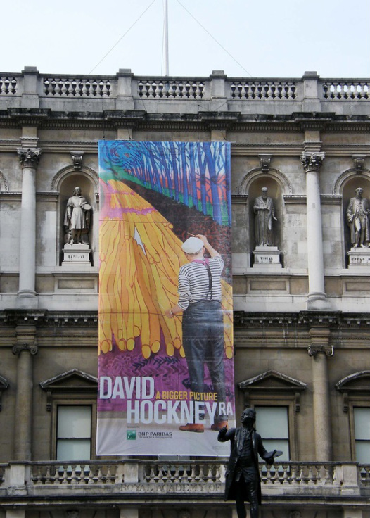 The Hockney was well worth the long que. Depth of colours in his paintings far exceed the reproductions of his work. As a collection, the amount of images are fairly overwhelming. Hockney paintings, ipad prints and video installations fill every single room in the Academy, which is no mean feat for his last three years of output. The Monet like repetition of his seasonal views and the capture of his Californian stlye colouring to portray the landscape of his home, Yorkshire, is enjoyably intense. If you plan to go - buy fast track tickets, take drinks, snacks, and sunscreen or a brolly, oh and comfy shoes ! There was a lot of waiting around. Two hours was an average ! My day finished in even more spectacular surroundings. Goldsmiths lit the Hall with candles to celebrate the 30th Anniversary year of the Goldsmiths Fair. It was stunning and quite magical.....makes a breath taking change from the workshop!   I travelled today with the Bluecoat Display Centre gallery team and Robert & Joan Porter with their students to the jewellery quarter in Birmingham. The first stop was the Museum of the Jewellery Quarter, which houses fine collections of techniques, materials and displays of workshop settings that give an insight into the historical working life of the trade. Alongside the main collection was a selection of works marking the bicentenery of Pugin.  Metalsmith, Cathy Miles hosted our next visit in her workshop full of fabulous wire works. Cathy's links to Liverpool stem from the Nextmove residency at Liverpool Hope University. After the programme she relocated her practice to a workshop in the Quarter. Her designs take the form of three-dimensional drawings that document observational view points from everyday life. Birds feature typically in her pieces and recent work references ornametal pattern and traditional forms. Cathy's work comes back to the Bluecoat during May as a feature artist in the Display Centre Window exhibition.  Our final desitination was the Birmingham Assay Office, where we listened to a talk about the history of Hallmarking and discovered what The Birmingham Assay Office does in the 21st century.
The present building is a treasure trove of period features but plans are underway to move to an upgraded building, which will accomodate the extended services that the company offers. The opportunity to view the spectacular Silver Collection and the Library was a real treat. It emphasised the sense of a continued history and highlighted the dynamic work that is on going though to present times. The Birmingham Jewellery Quarter is also the home to tool shops, bullion dealers and commercial jewellers. However, apart from a quick browse around the RSBA Gallery where a lovely display of vintage inspired jewllery adorned the gallery shop, a lack of time prevented more exploration through the streets. I think a return trip is on the agenda ! 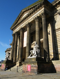 The Walker Art Gallery, Liverpool, was buzzing with activity today. Lucky print enthusiasts got the chance to hear Emma Gregory, print lecturer and manager of the Bluecoat Print Workshops give an informative talk through the stunning exhibition, The Art Books of Henri Matisse. Photography in the exhibition wasn't allowed but it's worth having a peek at the Liverpool Museum flicker pages HERE to see how the show looks. I was really fortunate this weekend to attend the Lazer Cutting Demo at the Bluecoat Print workshops. The event was hosted by Bluecoat print manager Emma Gregory and presented by Andrew and Caroline from art&designPOD, a design facility based in the Liverpool School of Art and Design. Demonstrations of cutting, engraving, and marking were intergrated with computer instruction on how to import drawings, and programme in designs on table top sized machines. It was a revelation to see just how attainable new technology can be. All done by the click of a button ! 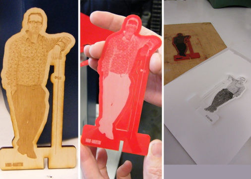 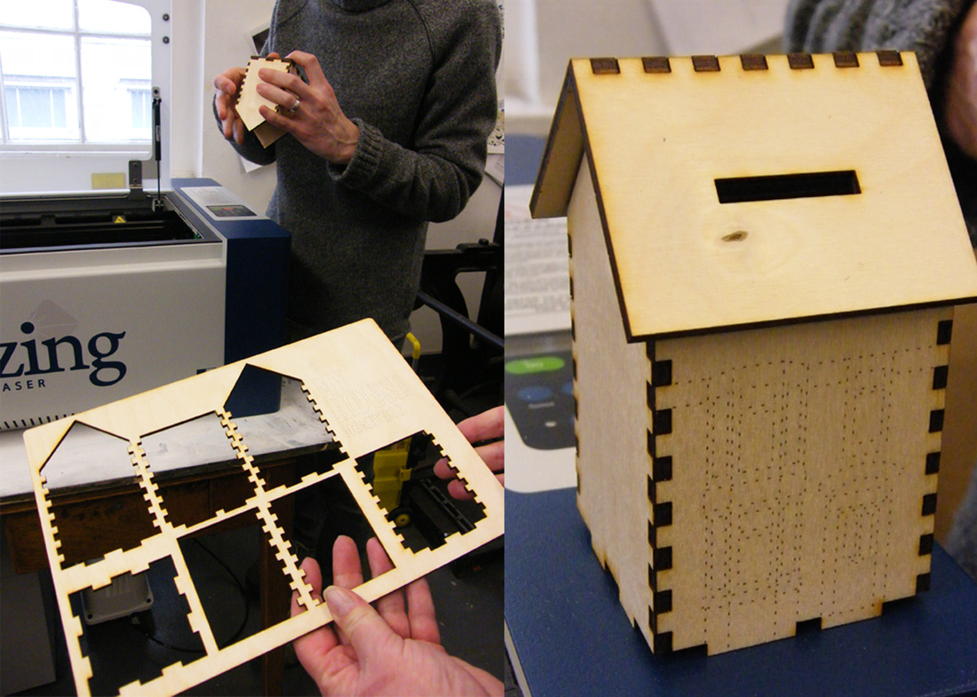 Just thought I'd post another of my favourite works from the exhibition curated by Phillip Treacy at Tate Liverpool. Corinthos by Barbra Hepworth 1954/5. The piece is one of the largest of her works to be carved from one block of wood. Formed from guarea, a tropical hard wood, the rich outer surface is contrasted with a painted matt white interior. Inspired by her visits to Greece, the sculpture represents ancient sights and Hepworth's experiances of light and landscape. In the gallery space, set amongst vivid pink walls, I enjoyed the experiance of viewing through and beyond it's mass. The interior of the work balances with the outer form completely. It is entriely beautiful. Discover more about Hepworth here on Artsy > https://www.artsy.net/artist/barbara-hepworth 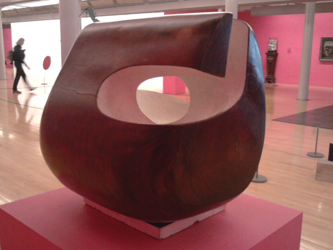 Certainly a talking point, and well worth trying to visit before the close of this exhibition on 12 April 2012, Tate Liverpool has some fabulous work in their "This is Sculpture" Series. Milliner, Phillip Treacy's display of wooden block formers are particulary stunning. 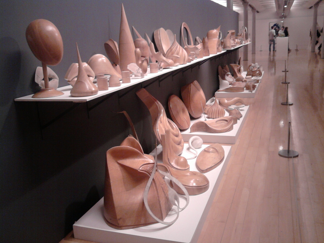 Please click on the link below to find out more about Tate Liverpool Exhibitions :
|
NEWS
Welcome to my posts. Here I add notes about events / interests / developmental work / and various inspiring stuff that catches my attention. Archives
January 2019
|
 RSS Feed