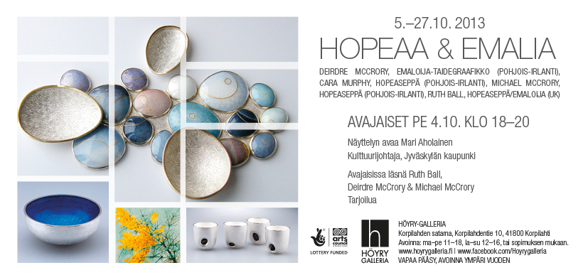
"Mersey Jewellers Go Platinum" 1994-2014
Friday 17th January 2014 - Saturday 25th January 2014. The Mersey Jewellers and Metal Artists Network (MJMAN) is a group of independent jewellers and metal artists working within Merseyside, originally set up in 1994 for mutual support, promotion and to encourage the highest standards of design and craftsmanship. These aims remain important today but as a group MJMAN has decided to disband in 2014 which will mark their 20th anniversary. Current members of MJMAN are busy exhibiting nationally and internationally so the decision to close the group and have a final retrospective in 2014 was made earlier this year. The Bluecoat Display Centre have strong links with key members of the group who they exhibit regularly and are delighted to be involved in the celebrations to mark their 20th year. This short exhibition, which is an addition to the Bluecoat Dsiplay centre's original 2014 programme, features selected members from MJMAN including Alison Bailey Smith, Ruth Ball, Judith Brown, Emma Farnworth, Elaine Jenkins, Linda Jeanne Jones, Julia Lightfoot, Kate Moult, Alan Phillips, Lisa Waldman & Anthony Wong. There will be an afternoon preview for this show on Saturday 18th January between 2-4pm. when some of the exhibitors will be available to chat about their work. EVERYONE WELCOME A great big THANK YOU to Craft & Design - find me in the "Makers Gallery" and "Enamelling in Europe"
Copyright : Craft & Design and Individual Makers
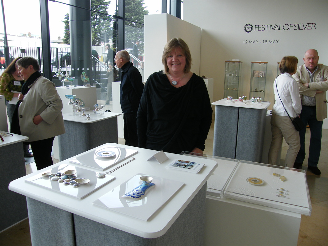 Photo by Rachel Gogerly I was selected for the specialist Enamel Day held on the 17 May at the Pangolin Gallery London, as part of the Festival of Silver Week hosted by Gordon Hamme and team at British Silver week. It was a brilliant day and lovely to meet up with visitors, clients and fellow enamelists.
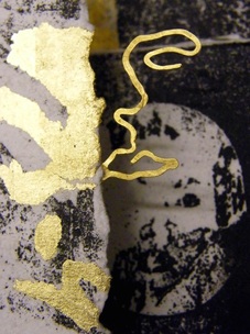
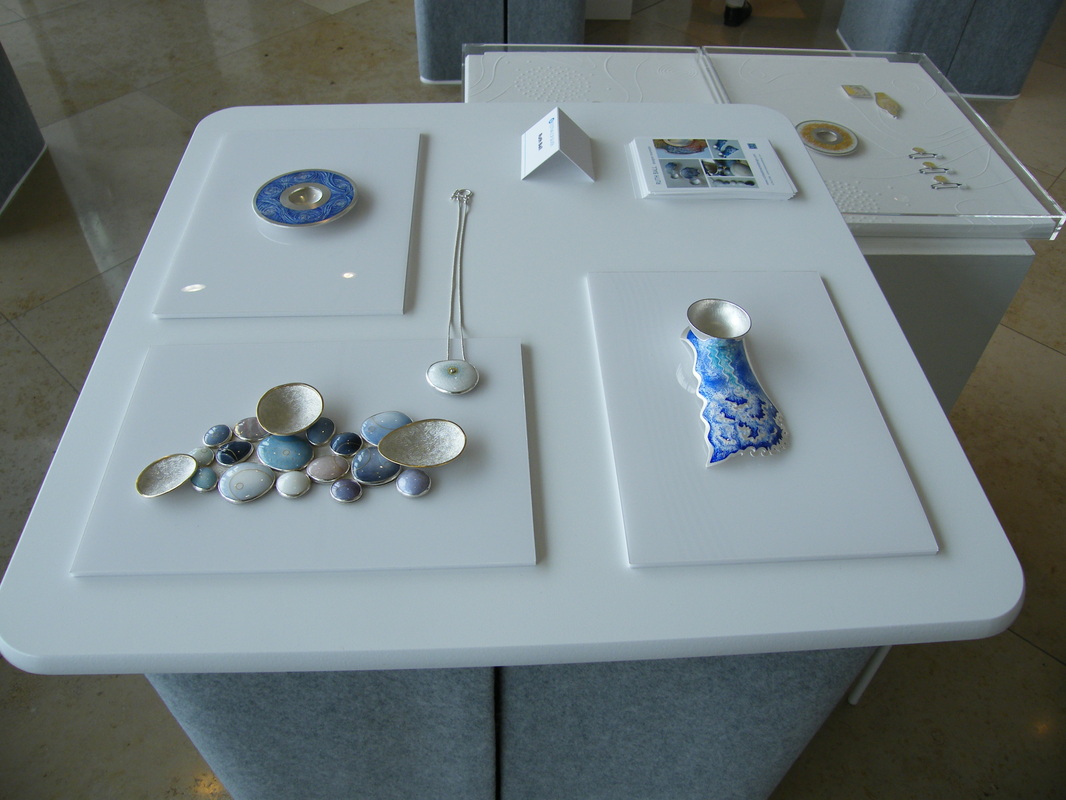
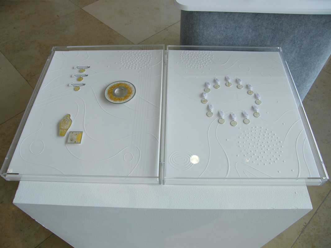
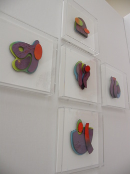 I had great response to my new work for the Bluecoat Display Centre theme "Heroic" which was displayed last week at COLLECT 2012 in the Sattchi Gallery, London. For their theme I chose to explore the work of scientists. The resulting main set of panels that I made celebrate the work of William Henry Perkins, who in 1856 at the age of 18 discovered the first aniline dye, which happened to be a shade of purple. His colour was called "Mauvine" and it is said that it's finding helped change the word. To the dismay of his Father and Tutor, Perkins abandoned his studies and went into production of the colour. His action went on to democratise the availability of such a luxurious hue by making it affordable through mass production. Previously it was a colour created by crushing thousands of shells and throughout history it was so expensive to produce that the higher classes, royalty and religious figures only wore it. His father and brother turned in the end to join and support Perkins by using their own building and architectural skills to build his factory. Proving his discovery successful, his tutor Hoffman, became supportive and also in later years went on to do his own further research into colour formula. 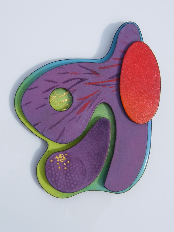 Perkins also found synthetic dyes for green and shades of red and violet. Hence the colour theme on the panels. I added a blue to also represent the fact that the factory was built on the side of a canal. It is noted that the water changed colour every week depending on their production. The shapes of the pieces are based on reflections and flow shapes in water to reference the flow of dyestuff and create an abstract format for the work. In the series each shape selection is different, and as part of the work I want to infer a serendipitous approach. The surfaces of the enamels are matt, granular and also occasionally glossy. Perkins was actually tasked with researching a substance that would cure Malaria. Failure to do so lead to his haphazard finding that the mix of chemicals he was working with presented themselves as a repeatable colour. The fact that he kept trying and had the vision to develop this into an industrial scale business is remarkable. The pieces are mounted individually in Perspex museum type boxes to suggest the format of scientific display. Each piece being like a specimen to examine. When Perkins retired at the young age of 36 he had become rich enough to return to his research and he is credited with being instrumental in as a catalyst for a wide range of important discoveries. The detection of synthetic methods of producing colour have been wide reaching so I have included within each one of the panels a circular point and an image to reference microscopic shapes / images from petri dishes. It is the fact that a colour can evolve to have a medical significance that I find particularly poignant. 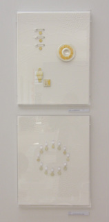 Alongside the lager panel I also exhibited two artworks called "Unknown" and "Unsung" .
There are many stories behind scientific advances and people who go about work that is heroic. They are humble and largely go unmentioned. The format of these cases are consiquently intentionally ambiguous. "Unknown" consists of 12 mini medal shapes hung in a circle format on a hand embossed paper surface. The images in the small medals are made in fine gold wire and foils. Fired onto transparent white enamel, they are based on drawings of matter in petri dishes, and inspired by an illustration of work done by German scientist Robert Koch, who worked in the same era as Perkins and became one of the founders of bacteriology. The ribbons are white to symbolise hope of new discovery and the circle shape is for continuity. The paper embossed lines echo the flow drawings of the colour panel. "Unsung" is dedicated to anonymous modern day scientists who we never hear about but do such invaluable work. The case consists of a 10cm diameter enamel on silver dish. The pattern is suggestive of bacterial growth forms. A colleague told me that it is the bacteria themselves that are the most fascinating thing. There are good and bad bacteria, they give us such delights as wine and chesses and the best can be used to fight the bad stuff! The three safety pins supporting an enamel disc are designed as medals to represent research in to the safetly of food production in infant formula. Additionally, there is a figure pendant which has a thumbprint illustration made in gold foils and wires that hint at the shape of a figure, which are a reference to hidden identities, plus a square brooch with finely worked abstract micro forms. I've used selectively yellow and gold on this piece as a celebrationary aspect. The combination also stands for preciousness. The additional fact it that yellow it is the opposite colour of purple and for me signifies the continuation of research in the modern day. Currently posting work out for "Anything to Declare" the premier exhibition of CURVE Gallery Newcastle, in NSW Australia. CURVE have had a gallery in Liverpool for several years and gallery manager, Lisa Who, is now working towards creating a tandem space where international exchange and contemporary art practice can evlove. 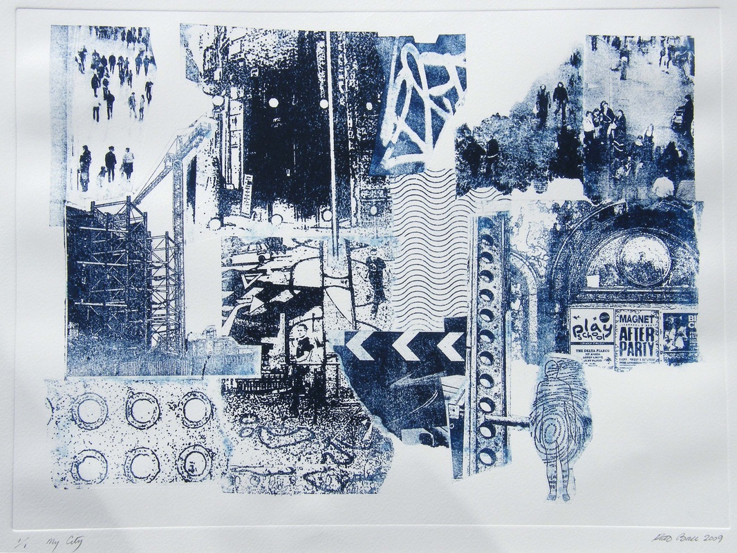 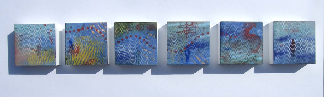 Curve will be exhibiting the work of artists that are profiled by the gallery in the UK, launching the concept of the space on the 27th of April to a brand new audience. Curve is an independent exhibition and studio space, collaborating with and promoting work by emerging and mid-career artists. Curve’s vision is to support, engage and expose artists by providing destination places that offer a direct link between Australia and Europe. The creative projects they devise are designed to comment on independent global curatorial practice and the journey of objects. The exhibition is a collaboration between Curve and Liverpool & London based artists working across disciplines that include film, sculpture, photography, printmaking & artist books. Exhibiting artists include Robyn Woolston, David Penny, Elizabeth Willow, Lisa Who, Hannah Fray, Hormazd Narielwalla, Emma Gregory, Graeme Williams, Ed Bruce, Pauline Hughes, Gill Curry, Liquid Sandwich, Colette Whittington, Ann Beare and Amanda Oliphant, and me ! My display will be formed from a selection of my Liverpool Series Prints from 2009 and my Crosby Beach enamel on copper panel set, created in 2011. I started working on this theme in 2008 as part of an ongoing, self initiated body of work. My intrigue was the changing cityscape, and the interaction of old and new as the area of Liverpool One was being built. The prints aim to project a sense of place, a theme that is echoed in the Crosby Beach enamel study. The beach at Crosby is the home of Another Place, a prominent visiting destination in my local area. Additionally, several prints pick up on graffiti and poster slogans which highlight the humour and maverick spirit of one of my favourite cities, Liverpool. 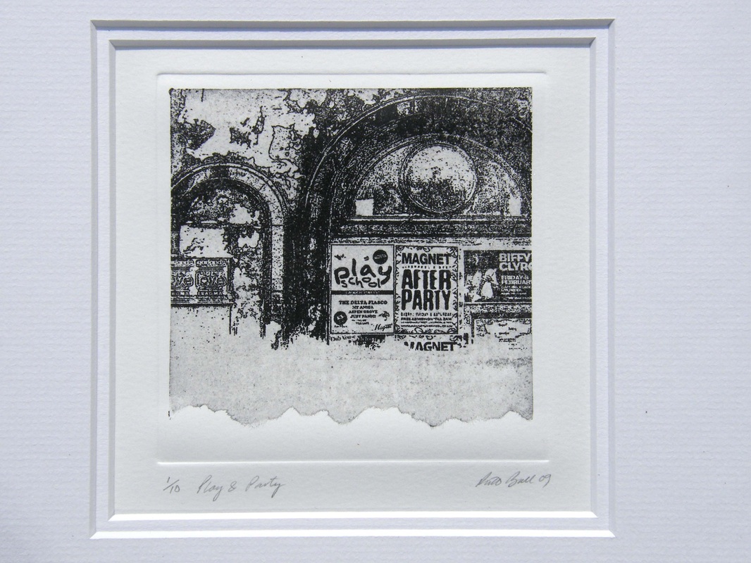 I like the idea of this series travelling from place to place and I'm delighted to be involved in the promotion of a new adventure.
Wishing the very Best of Luck to Lisa & her team ! Opening 27th April 2012 CURVE Gallery 37 Watt Street, Newcastle 2300, NSW Australia. Just thought I'd post another of my favourite works from the exhibition curated by Phillip Treacy at Tate Liverpool. Corinthos by Barbra Hepworth 1954/5. The piece is one of the largest of her works to be carved from one block of wood. Formed from guarea, a tropical hard wood, the rich outer surface is contrasted with a painted matt white interior. Inspired by her visits to Greece, the sculpture represents ancient sights and Hepworth's experiances of light and landscape. In the gallery space, set amongst vivid pink walls, I enjoyed the experiance of viewing through and beyond it's mass. The interior of the work balances with the outer form completely. It is entriely beautiful. Discover more about Hepworth here on Artsy > https://www.artsy.net/artist/barbara-hepworth 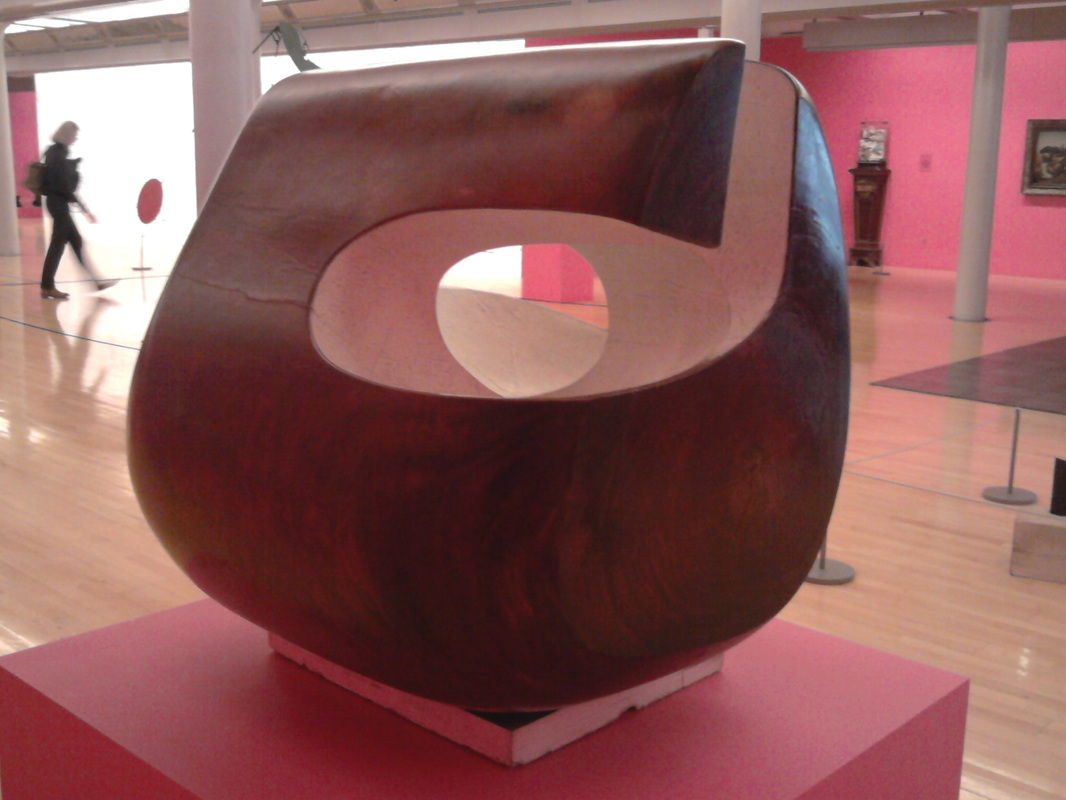 Certainly a talking point, and well worth trying to visit before the close of this exhibition on 12 April 2012, Tate Liverpool has some fabulous work in their "This is Sculpture" Series. Milliner, Phillip Treacy's display of wooden block formers are particulary stunning. 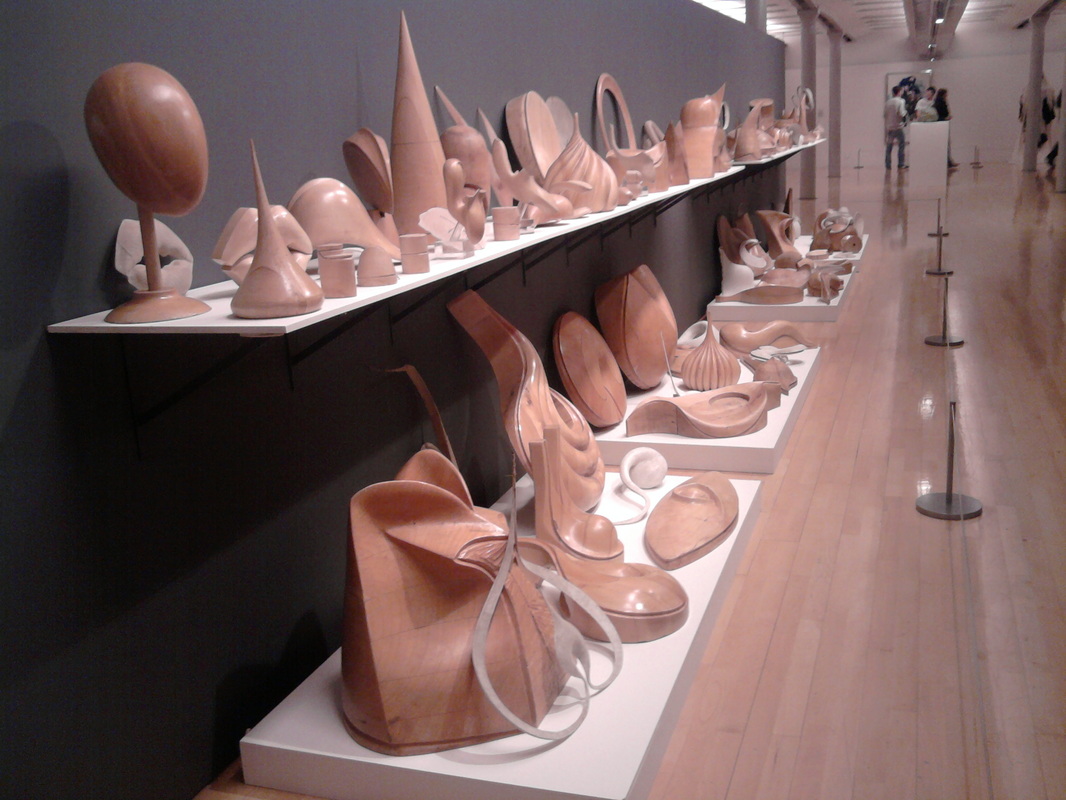 Please click on the link below to find out more about Tate Liverpool Exhibitions :
|
NEWS
Welcome to my posts. Here I add notes about events / interests / developmental work / and various inspiring stuff that catches my attention. Archives
January 2019
|
 RSS Feed