Artwork for the A&E Waiting Room @ " The Royal " NHS Hospital Liverpool
BRIEF:
The Trust will refurbish the main A & E waiting area, bringing it up to date with clean, fresh contemporary colours, which will provide a more relaxing and comfortable waiting area for patients . The interior finishes will provide one colour accent wall, including an information point, run by specialist volunteers during office hours. Other walls will be painted in a light colour to emphasize a feeling of space and enhance an area that currently has very little natural light. Lighting and acoustics will help to soften sounds and prevent harsh lighting effects.
Information boards will give clear indications of the patient journey, depending on needs to help orientate, reassure and clarify the A & E experience for patients. (Teal and Yellow as per Design Council brief).
On two walls, there are glass panels, for which new designs are required. The key elements within the designs for this brief are.
- Light, bright (aqua) tone colours to give a feeling of space, openness and uplift and work with indoor lighting.
- Elements of the design to reflect partly, but not wholly, the city of Liverpool. (and possibly wider areas of catchment area )
- A semi abstract concept which includes text and quotes (copyright allowable)
- A reflection of the many different cultures that use this space, drawn from the Yemani, Somali, Polish, English and Chinese communities.
- Text quotes, could be from literature and/or words of comfort. There are a wide range of users of A&E services from all walks of life . Text should be subtle and not dominate the artwork, which should mainly be comprised of colour and imagery and a sense of space.
FINAL DESIGN :
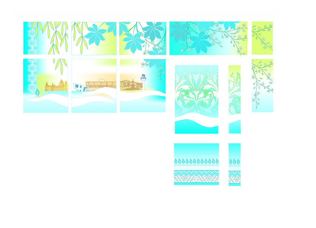
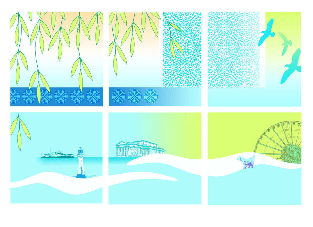
I chose images of Liverpool that can be easily recognized, They were abstracted alongside foliage and wave imagery.
The colours used reflected the newly painted areas in the room and were selected as calm and relaxing combinations.
The patterns within the artwork reflected the cultural elements required in the brief. each culture is represented by a pattern.
The text elements for the core care words were added as separate panels as the artwork was placed on the windows this allowed for the information to be more easily read - the text panels, which were translated into each language can be viewed form the link at the bottom of the page. The sayings were chosen as light heartening and thoughtful quotes.
AS a resulting placement of the illustrated vinyls being placed on the windows, the interconnecting departments all benefited from the artwork. Reception / St Pauls and the A&E waiting area all had the bonus of screening and each area could have the image as they were place in a way the made them view-able from each side of the window.
Window facing reception / group of six panels
Window facing reception / group of two panels

Windows facing St.Paul's Clinic / group of four panels

Windows & Door facing St.Pauls Clinic / group of thirteen panels