
|
These pages follow the progress of my commission for the new NHS Breast Screening Unit at Broadgreen Liverpool. The commission commenced in 2012 and was completed in February 2013. Please scroll through to view the blog postings to see the development of the final works tracking back to the initial stages of the brief. THE BRIEF :
The unit would like a unique piece/pieces of artwork which will be titlled " A Sense of Place". It is desired that the peice would have rich jewel like colours rather than the traditional pink associaletd with breast cancer. We would like the artist to create work that has a contemporary feel and a sense of movement, through multiple connected pieces. We would like the unit to have artwork that is distincitve to the unit and work that uses different colour and imagery from the connected ENT Unit. In addition to the main pieces it is desired that collaborative pieces should be created for the corridoors > Working with Sian Hughes the artist commsissioned for the ENT & Pain Units, you are required to create distinctive pieces for the link corridoors within the timeframe and budget allocated. This work should incorporate natural themes such as "water" and or "a sense of place". All commissioned pieces must comply with infection control, health and safety and fire regulations and should be robust and easy to clean. FEEDBACK From Nicky Duirs - Arts Officer, Royal Liverpool & Broadgreen University Hospital NHS Trust Recomendation posted on LINKEDIN. "I commissioned Ruth to undertake a complex design/public art commission in The Royal Liverpool & Broadgreen University Hospital NHS Trust. She was professional and with high artistic design skills and awareness and produced some beautiful work to enhance our newly refurbished Audio and Breast Screening unit. I would highly recommend this artist." Service Category: public art commission Year first hired: 2012 Top Qualities: Great Results, Personable, High Integrity THANKS I would like to add my Greatest Thanks to Nicky, and to Sian, plus all of the teams who helped on this commission, making it such a positive expericence. It was a pleasure and a great privilage to be involved on this exciting project. The final phase of the commission is now complete. The brief included a collaboration aspect, and it was wonderful in the final months of the time frame to have the opportunity to work with Sian Hughes, who was also installing artwork for the other areas of the new unit. We created and co-ordinated a series of artworks which were place in the route throught the new unit from the ENT waiting room where Sian's Artwork was placed, through the curved corridoor and out into the route corridoor to the Pain Treatment Rooms. The intension was that each artwork area should be different, but they would co-ordinate, and the overal theme was to be water and natural images. The main aim was to link each others areas of work and create a welcoming ambience throughout the departments. Part of the collaboration also facilitated a sharing of skils and ideas, which we sucessfully achieved through working in a new media to us both, printed acrylics.
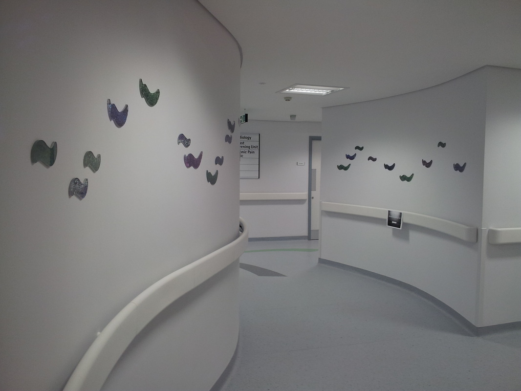
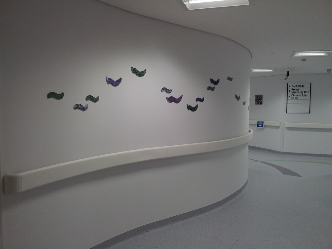
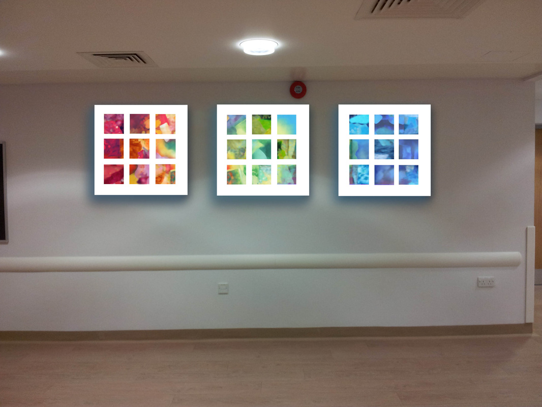
In the curved space we placed printed acrylic shapes. The images were initailly based on our photographs of reflections in water. We each worked with shapes in the photos to create three units which worked together to form a flow pattern. The colours were altered digitally to match with the strong blues in Sian's artworks and the jewel colours in my enamel panels in the Breast Screening Unit. The resullting work is mirrored on each wall of the corridoor and they are designed to lead the visitor visually through the space. 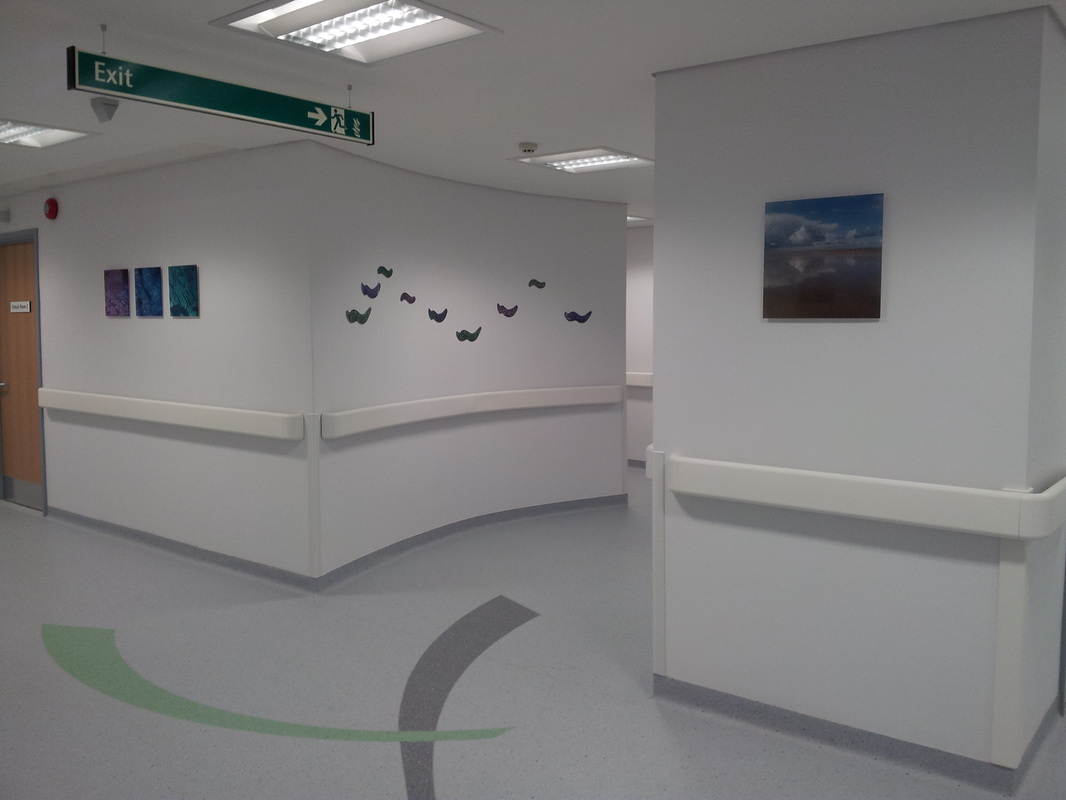
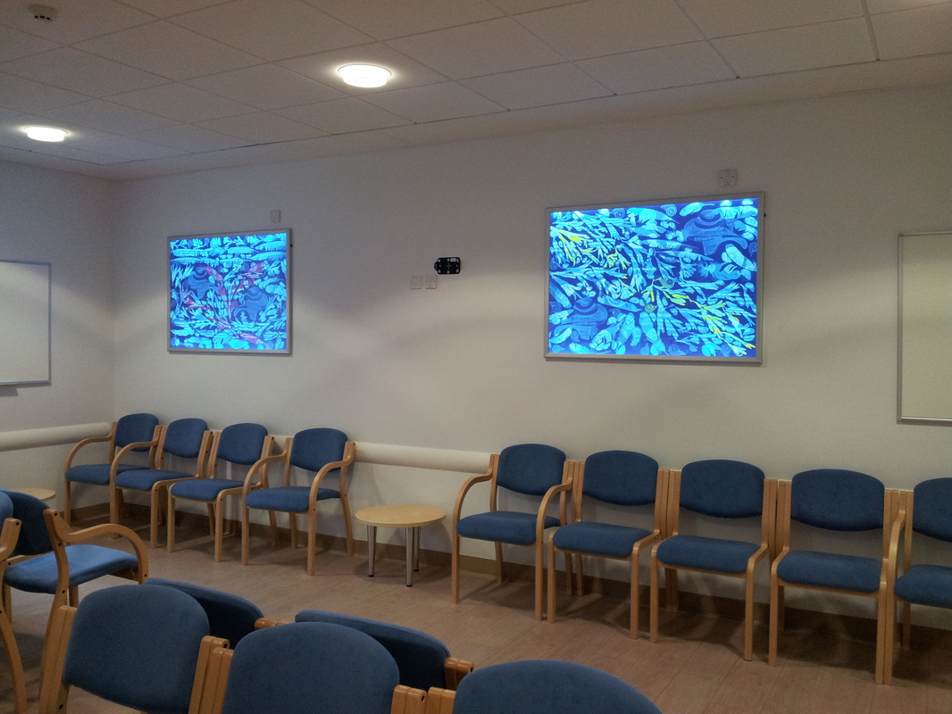
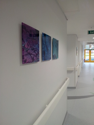
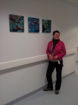
Here is Sian in the next route corridor - Once you are through the curved space there are further corridors to the Pain treatment areas and Breast Screening. For this placement we chose to link with square panels which echo the shape in my art work in Breast screening and also with Sians ceiling tiles in the treatment rooms. The printed acrylic panels reflect each others pieces and are sited on each side of the corridor. In Sian's work for the pain unit, her images are of rockpools with added objects to take interest and make a distraction on viewing. I compimented her vision with my semi-abstract images of rock formations in complimentry colours, which also visually link with the colourway in the wave shapes on the curve. In the photo above you can also see that there was an additional image selected of a beachscape. This was one of my water images that was arresting for its spacial, peaceful atmosphere and was an alternative suggestion of water. It was also a visual link to the video instalation in the Breast Screening Departement by a third artist commissioned Mark Cameron Minard, who's work is based on fine photography and screen based arts. For me working with the new media was quite thought provoking and a useful process in developing not only ideas for future enamelling but a revelation in the fact that there are alternative materials to explore...... 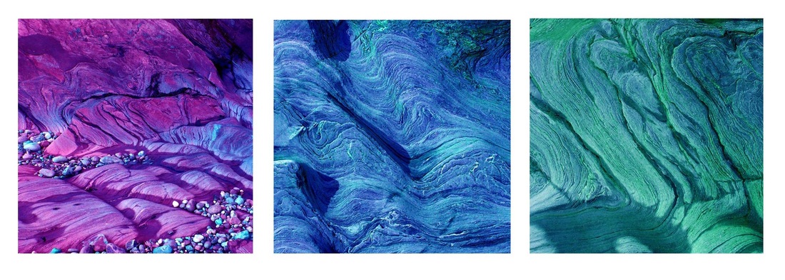 All panels for the waiting room are now complete and on the wall ! phew !....next job is the curvy corridoor ! 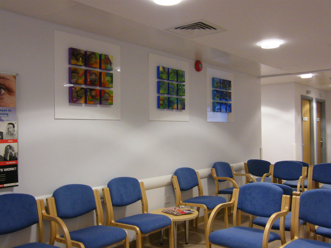
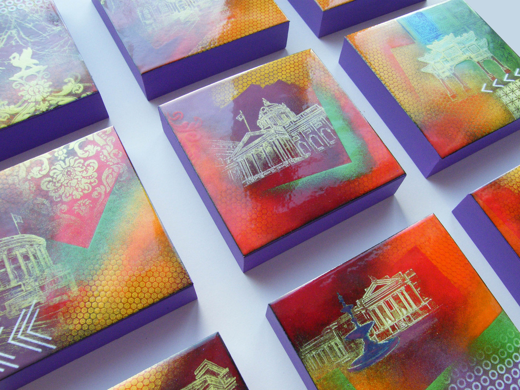
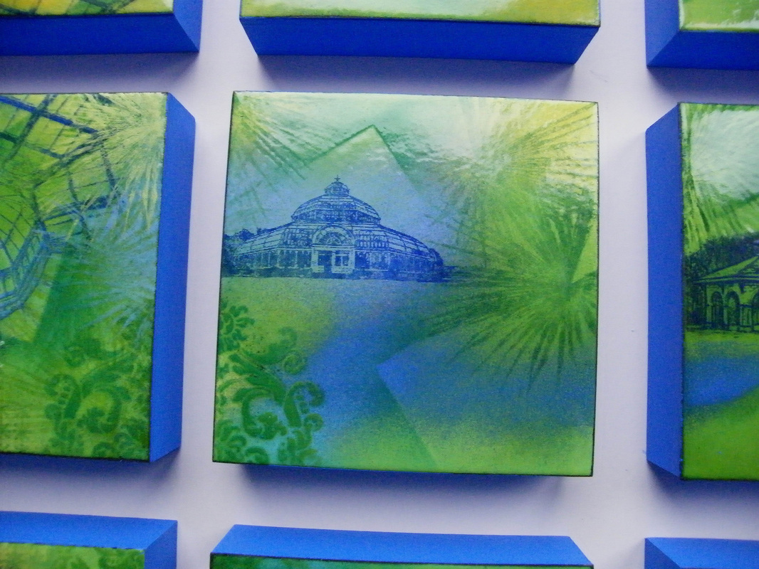
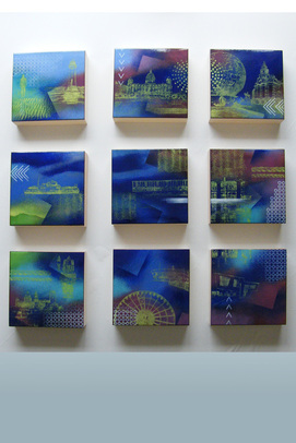
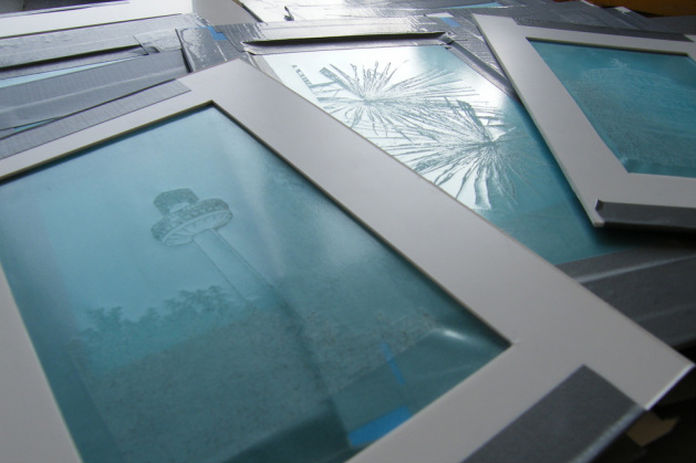
Each panels is 15x15cm. Each panel set measures 80cm square to the outer prespex back support frame. The panels individually carry a sperate image, which when viewed as a whole, the series of images represent the three key areas requested in the commission. Waterfront, Green Spaces & Heritage Landmarks.
The first set of panels are finished and now installed in the department. The enamels for Parks & Greenspaces plus City Landmarks are on their way........
The panels are really taking shape now. Starting to apply screen images and make final firings. 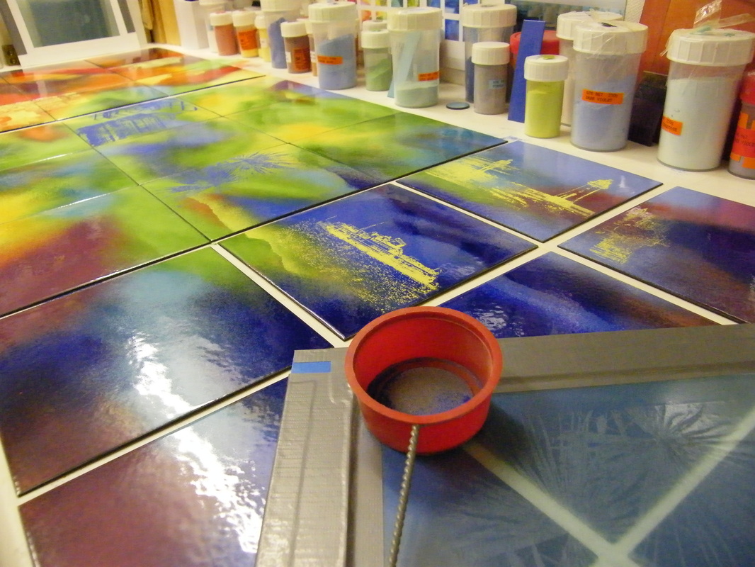
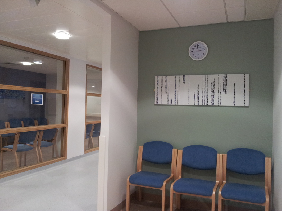
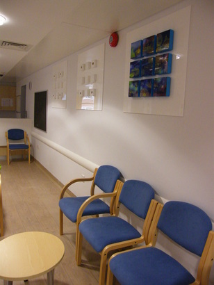
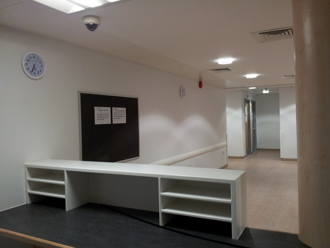
The site is now ready and waiting for the artwork ! Its really exciting now being able to visualise the space. This is the waiting room in the breast screening clinic > view corridoor images here
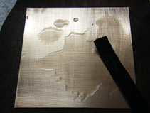
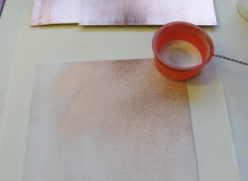
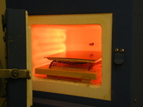
Here the first layer is now fired. More enamel needs to be added to build the layers. This is a point where I also play about with the position of screen printed images. 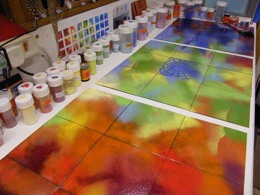 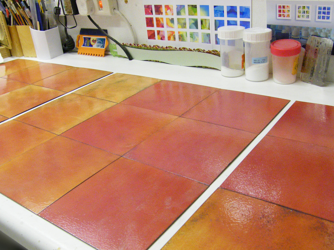 The pieces are underway, the plates are now prepared for the enamel colours. Each plate has been cleaned and degreased, a base coat of flux and also a counter enamel applied, and they are each fired individually.
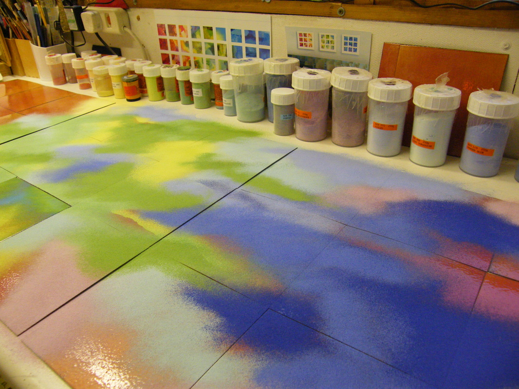
Alongside the illustrations the connection between each panel is colour. Initially the colours are visualised, just as a guide. The aim between each panel is that there should be a continuity and link, so some colours will overlap as will the images, which will provide visual"bridges" between each section. The illustration below is merely a part of the process. From this basic outline there can be many changes as I work between computer sketches like this, and the actual enamels as I make the piece. It also helps to think about the pieces in a room setting. Here the rough computer mock up gives some sort of idea of scale. Each of the panel set overall will be 80x80cm in size, and every square is to be 15x15cm. 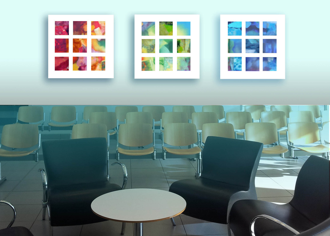 The next stage is to develop the artwok in readiness for planning the screens that will be used for printing onto the enamel surfaces. Photos are selected, and then manipulated with a mixture of digital and hand drawn approaches. The main factor at this point is to create a line drawing from the visual aspects in the photgraphs. Quirky views like this work really well to start a dynamic in the collage process once the screens are applied. This is one of the globes which form part of the War Memorial on the waterfront, with a view of the Liver Building in the back ground. 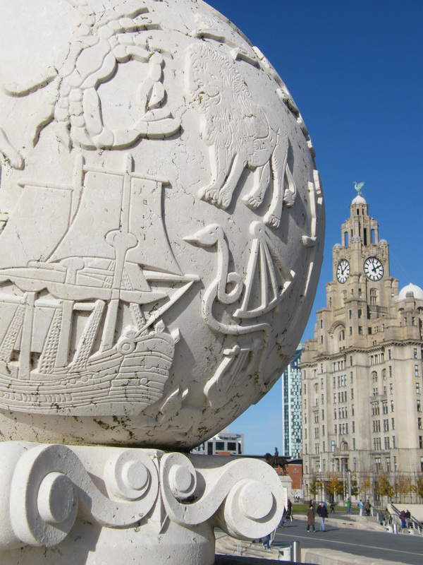 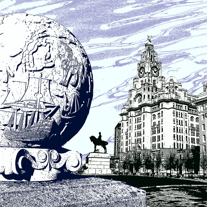 Slightly different views where studied to create this version. Defining the King Edward Sculpture adds another element and gives a better impression of the space between the architectural points. Removing the buidings in the background give the image more clarity and less "visual noise".
From the selection of images, I develop worksheets that then focus on specific areas. This helps to define the character and amosphere of an area. For the artwork it is important that the images are not just set illustrations of buidings in a typical style. The process is to develop the images through colour and some abstraction to make them collage, then make them link and flow to visually work together. The aim being to create piece that is recognisable in terms of "Place" but diverse and contemporary in feel as an artwork. The intention is also that the work gives the "sense" of belonging and something the veiwer can link into and feel part of. Here are some Examples of worksheets > not all images will be selected, these are "theme" sheets to get an impression from so that they can be discussed. 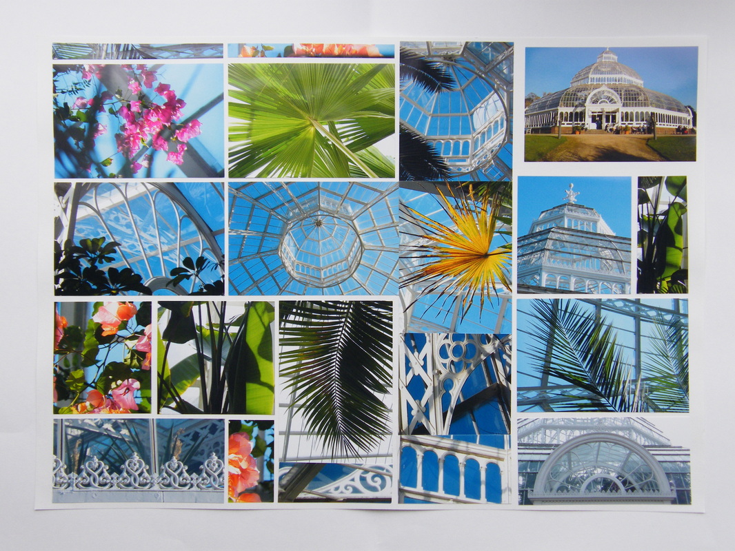 Sefton Park House, a stunning light filled space, and a particulary great spot to take in a free afternoon concert. 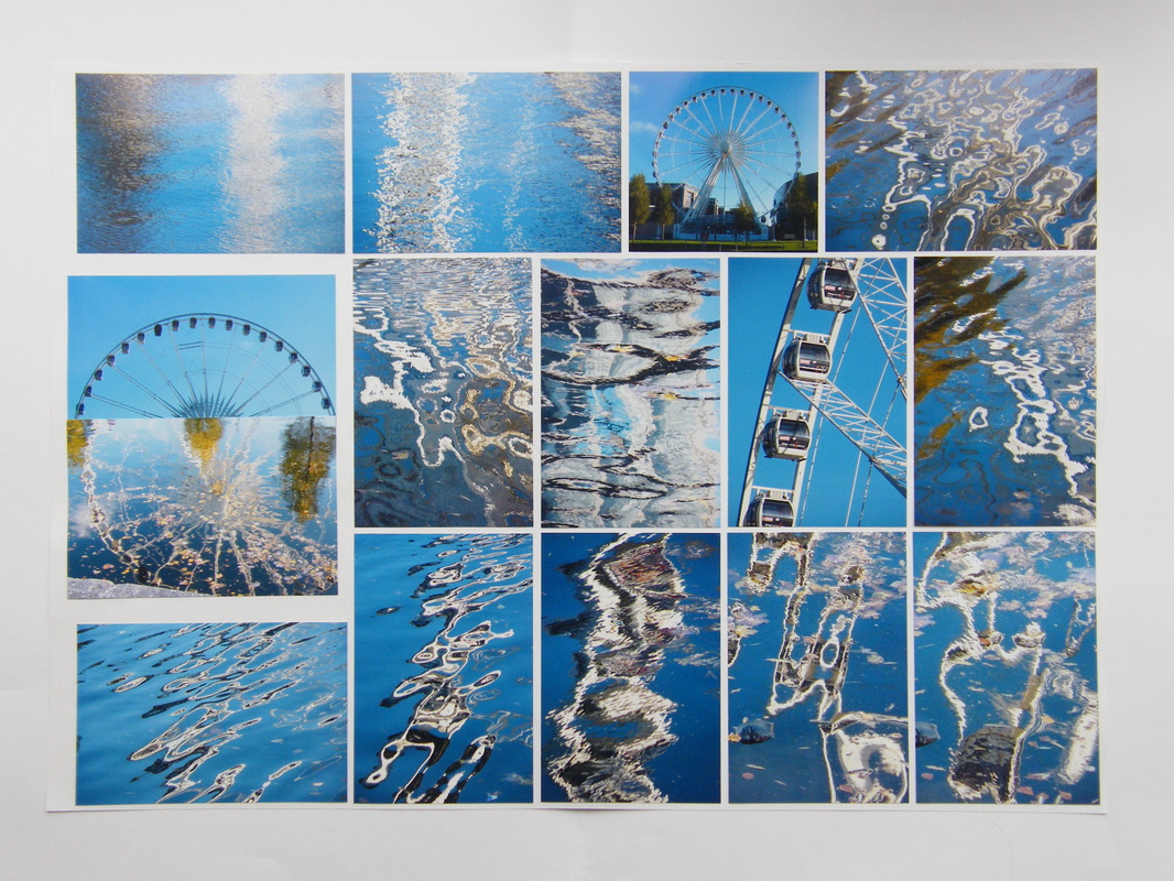 Refections of the Big Wheel at the Albert Dock. Some of these refections seems very rich with potential ideas to me now as I took them after viewing the Monet/Turner/CyTombly exhibition at the Tate Gallery Liverpool. 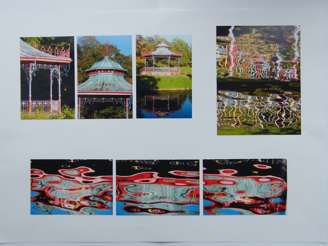 Here is Sefton Park Bandstand, which was apparently the originial inspiration for Paul McCartney's Sergent Peppers Lonely Heart Club Band Album. Knowing this now makes the refections here seem reminisent of the sixties with its pop-art and that surreal vibe in the Beatles music. 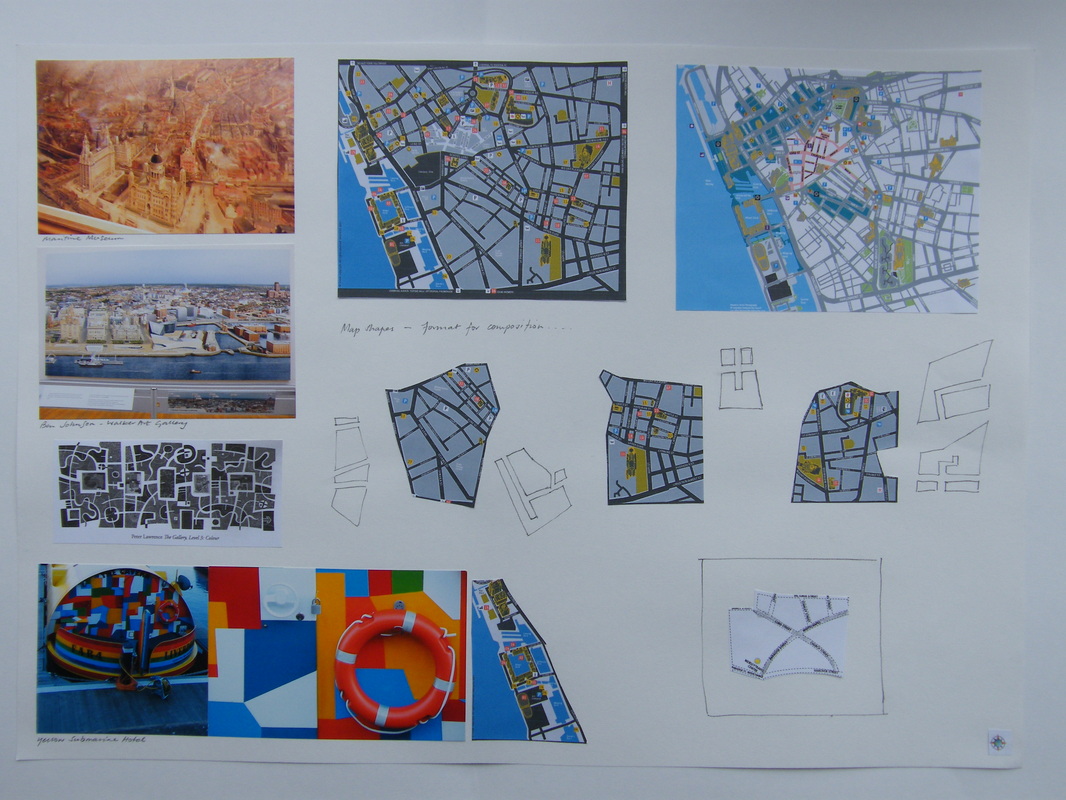 Althought the composition of the artwork is settled as the grid tryptyc, I've included this worksheet here as I like it as an idea for another format. As part of my research I visited the Walker Art Gallery which houses the Ben Johnson Painting titled "The City of Liverpool" and also the Maritime Museum where there is a painting of early liverpool illustrating a similar view of the city > view these images here.
I was taken with the idea of the the structure of the city, and enjoyed the thought of having mapped blocks. The city grows outward from the waterfront and it would be an interesting concept to follow up at some point. On this sheet there is also a photo of the "Yellow Submarine" Boat Hotel and a print I love by Peter Laurence, these two images also have a block format. They are geometrical but more organic than my blocks and I'd like to oneday follow this avenue for some self directed future work. Liverpool is a city that has a wonderful mix of architecture old and new. It boasts a fabulous heritage and is a place that is rich with character and vibe. It is of course a different place to different people and in discussion about the commission it was reflected that the illustrations within the panels should cover the wider area around the city to connect with the catchment area of the visitors to the clinic. 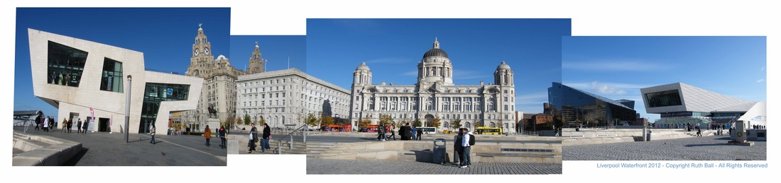 In order to get a feel of what the staff enjoyed about the city and what their expectations were I photgraphed many different aspects of "place" from the modern refections in buildings to the main landmarks and the various cultural aspects of the city. 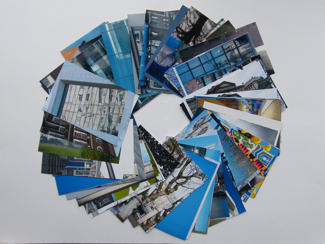 From this diverse collection of images the staff made their individual selections...... Within this selection we noted three different themes that would become the elements of each panel > Waterfront > Green Spaces > City Landmarks. 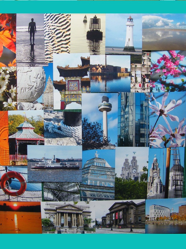 From the interest in the format of my previous work I submitted a selction of grouping possiblities for the colour squares that were favoured by the staff. This was intially quite basic but the clear choice was the option of a group of three nine square panels, which will form a tryptic in the space. 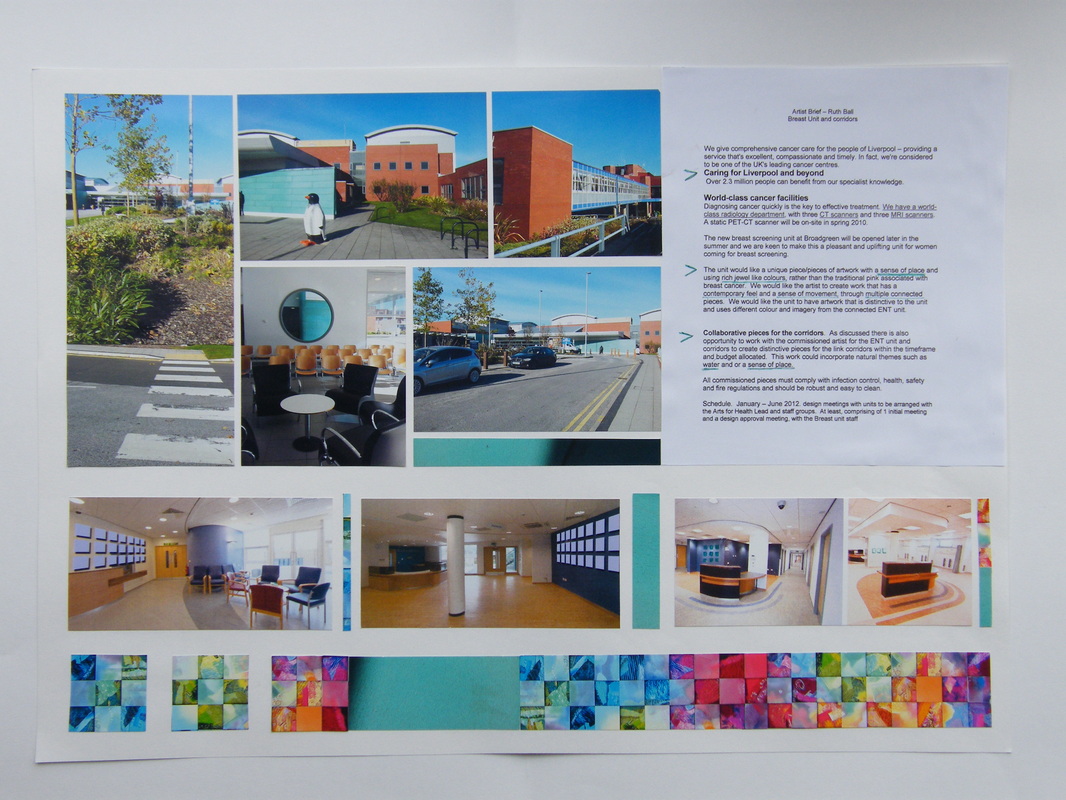 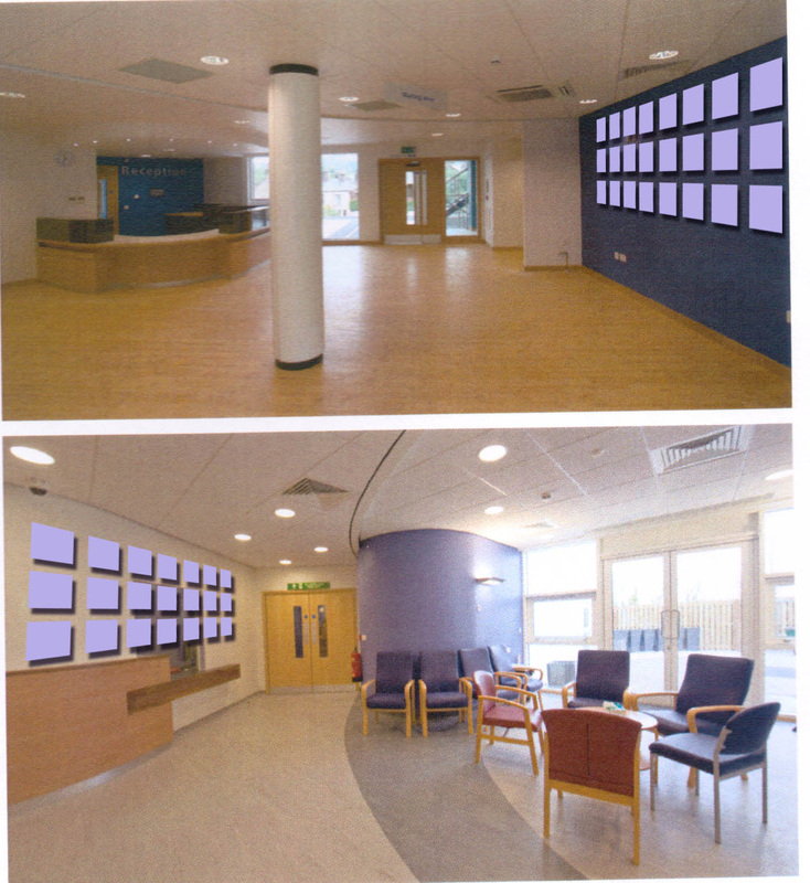 Rough images to show the idea in a typical waiting room area. (Image from Nightingale Associates). The favourite option was three sets of nine, rather than a continuous wall of panels. This was thought to be useful in structure because on a practical level the three sets will be easy to hang, and also it will give the oppourtunity for the work to carry different themes. 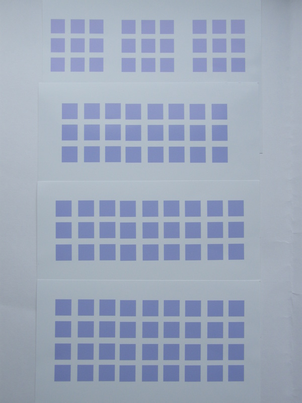 Arts Officer Nicky Duirs and the staff at the unit where intially atttracted to some of my previous work. They liked the lively geometry and strong colours in preivous enamel artworks on my website. This formed the starting point of my investigation into the commision design. 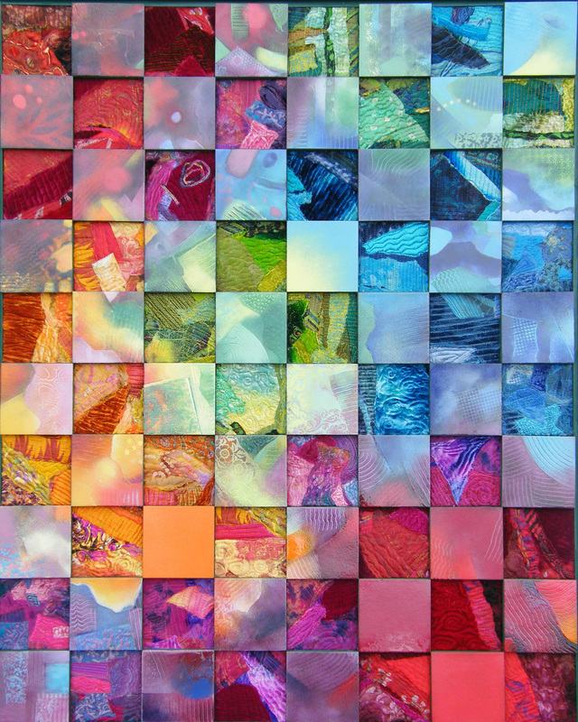 40/40 Colour Concepts No2 - overall size 80x100cm 40 enamel on copper / 40 textiles - Collaboration with Mary Brodie. 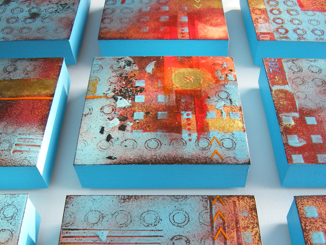 "Off The Wall" - Nine 15x15cm squares, overall size with frame 80x80cm Enamel on Copper. 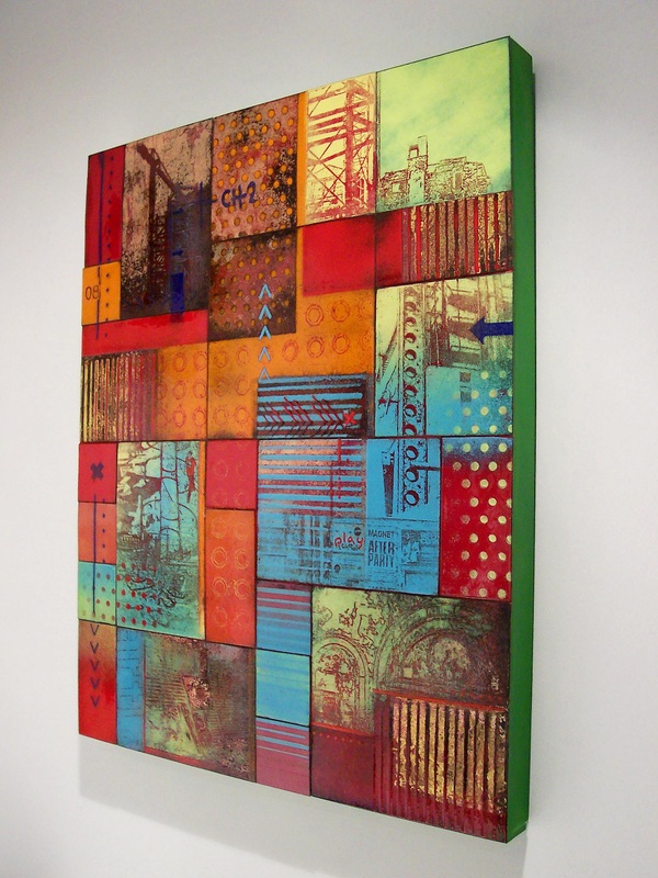 "In The City " - 40cmx50cm - enamel on copper.
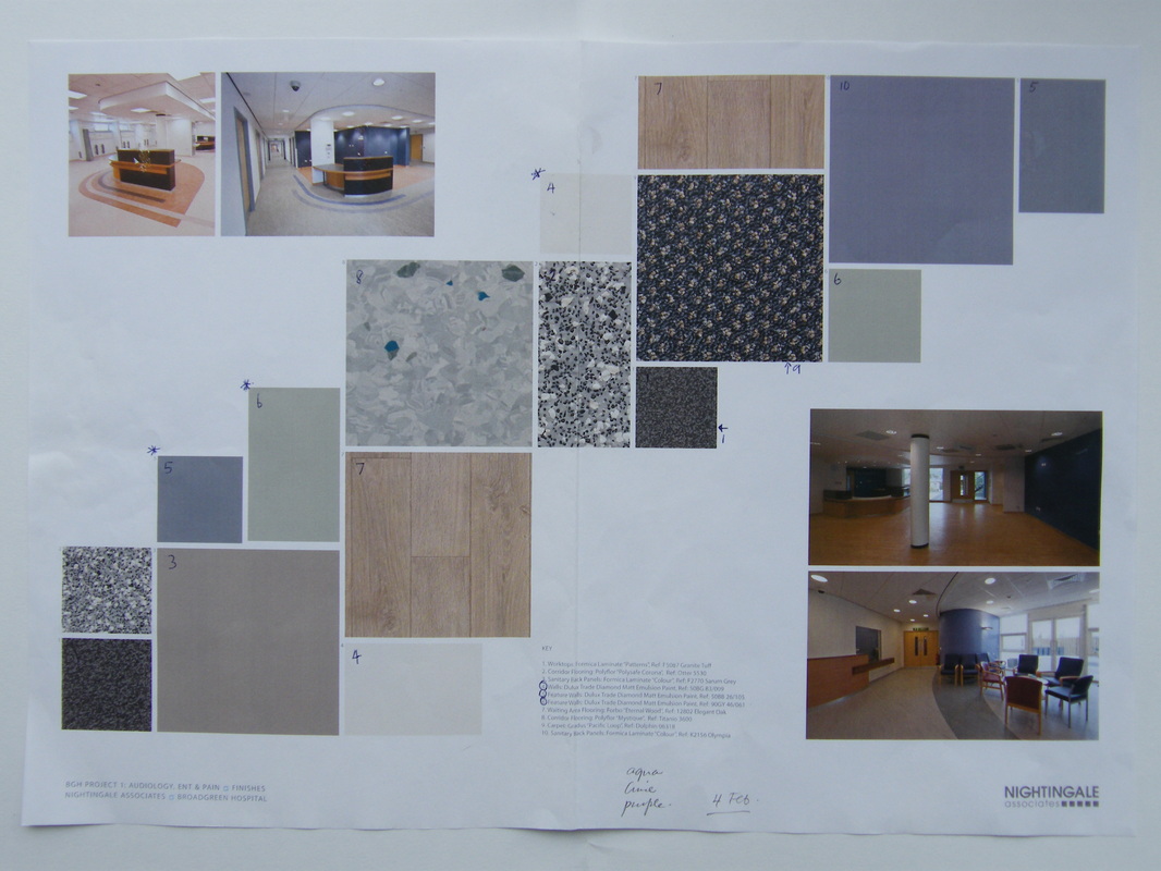 This image above reveals the planned colours for the waiting area. Neutral tones and a bright modern feel to the room is the back drop for the commission. The image above is proposal artwork from Nightingale Associates. Below the image shows the waiting area in the main entrance of the hospital. Visiting the site was useful to get an impression of the spaces there. I love the aqua colour of the building exterior which is viewed through the circular waiting room window. This colour is common to several of the Liverpool Hospitals, so my thoughts are to combine it in the artwork as a key colour. I was also impressed by the circular grouping to the chairs, shown here in the forground. This seems a less regimented and more human solution to the convention sitting areas. Though a combination of two systems are at work here ! I also noted that the light and sense of space make this area fresh and welcoming, which is an element that I would like to evoke in the artwork itself. 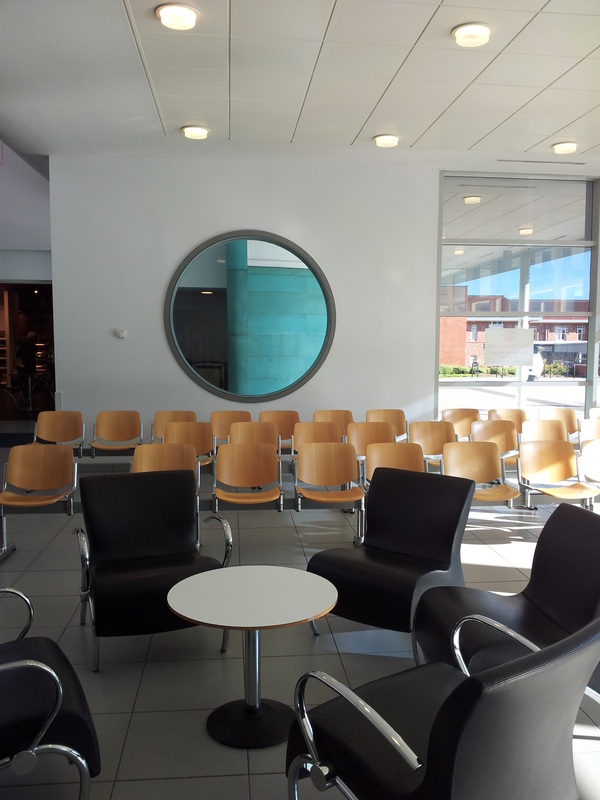 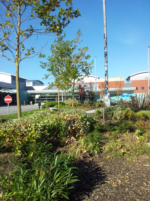 Broadgreen Main Entrance Broadgreen Hospital covers a large site and is situated in the outer district of Liverpool's Centre, near to the end of the M62 at the junction of Queens Drive and Thomas Drive. It is approximately three miles from the Royal Liverpool University Hospital. The Broadgreen Hospital site is shared by two other NHS Trusts: Mersey Care NHS Trust's Broadoak Unit and the Liverpool Cardiothoracic Centre (CTC). View Map Here The new Breast Unit will be sited in the Alexandra Wing and will be linked to the other new clinics for ENT and Pain. 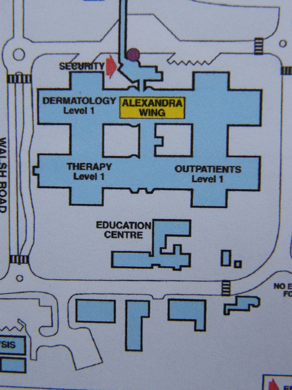 * "Broadgreen Hospital has been largely rebuilt in the last 15 years and is the main location for all our planned general, urological and orthopaedic surgery, diagnosis and treatment, together with specialist rehabilitation.....
.....The hospital shares the site with the Liverpool Heart and Chest NHS Foundation Trust, Liverpool Community Health and Mersey Care NHS Trust." * Quoted from the NHS website Earlier in the year, I was invited by Nicky Duirs, Arts Officer at the Royal Liverpool Hospital, to respond to an invitation to create a significant piece of enamel artwork for the new breast screening unit, soon to be opened at the Broadgreen Hospital Site. As I am now about to start work on the project this series of posts will document the progress of my work.
About the Unit : "The facility in Liverpool gives comprehensive cancer care for the people of Liverpool - providing a service that is excellent, compasionate and timely. In fact they are considered to be one of the UK's leading cancer centres and care is for Liverpool and the regions beyond. Over 2.3 Million people benefit from their specialist knowledge. The unit has world class facilities and diagnoising cancer quickly is the key to effective treatment. They have a wolrd class raidology department, with three CT scanners and three MRI scanners. A static PET-CT scanner is also planned for the site. The new breast screening unit at Broadgreen will be opened in February 2013 and the aim is to make the enviroment a pleasant and uplifting place for the women coming in for screening." THE BRIEF : The unit would like a unique piece/pieces of artwork which will be titlled a "sense of place". It is desired that the peice would have rich jewel like colours rather than the traditional pink associaletd with breast cancer. We would like the artist to create work that has a contemporary feel and a sense of movement, through multiple connected pieces. We would like the unit to have artwork that is distincitve to the unit and work that uses different colour and imagery from the connected ENT Unit. In addition to the main pieces it is desired that collaborative pieces should be created for the corridoors > Working with Sian Hughes the artist commsissioned for the ENT & Pain Units, creating distinctive pieces for the link corridoors within the timeframe and budget allocated. This work should incorporate natural themes such as "water" and or a "sense of place". All commissioned pieces must comply with infection control, health and safety and fire regulations and should be robust and easy to clean. |
NHS Broadgreen Commission
Copyright Ruth Ball Archives
March 2013
Categories
All
|
 RSS Feed